---
title: "Analyzing and Predicting Delays for the NYC Ferry System"
subtitle: "2026 MUSA Practicum Project Supporting the NYC Economic Development Corportation"
authors: "Yiming 'Ming' Cao, Sujan Kakumanu, Tyler Maynard, Guangze 'Simon' Sun"
format:
html:
number-sections: true
code-fold: true
favicon: ../nycferry-musa.svg
execute:
cache: true
---
::: {.d-flex .gap-2 .mb-4}
[Launch our Application](https://sujankakumanu.com/musa-8010-nycedc/){.btn .btn-primary .btn-sm target="_blank"}
[Go to the MUSA Practicum Page](https://pennmusa.github.io/MUSA_801.io/){.btn .btn-primary .btn-sm target="_blank"}
:::
```{r setup}
#| message: false
#| warning: false
#| cache: false
# Set options
options(scipen = 999, dplyr.summarise.inform = FALSE)

# Packages
if(!require(pacman)){install.packages("pacman"); library(pacman, quietly = T)}
p_load(tidyverse, sf, viridis, lubridate, kableExtra, gridExtra, ggthemes, ggspatial, leaflet, spatstat, spdep, htmlwidgets, concaveman, patchwork, yardstick, arrow, broom, car, scales)
```
# Use Case
NYC Ferry launched on May 1st, 2017 with a broad goal: connect underserved communities, complement existing transit, and support growing neighborhoods. That mission is reflected in how the system is designed — single-seat rides are possible between communities as far apart as the Bronx and the Rockaways. Since launch, the system has crossed 50 million riders and today spans 5 routes operated by 38 custom-built vessels across New York Harbor.
This project was done in partnership with the NYC Economic Development Corporation, the operator of NYC Ferry, to support on-time performance through better operational forecasting. The use case centers on an operational manager who needs to allocate resources — upland agents, sweep boats, vessel assignments — ahead of anticipated delays.
This breaks down into two key deliverables. First, an associative model exploring the historical contributing factors to delays between landings. Second, a predictive model that estimates the probability of an excessive delay (>10 minutes) between landings up to 48 hours ahead of a scheduled departure. The latter feeds into a web-based application designed for operational use.
# Exploratory Data Analysis
## Ridership and Trip Data
**By: Guangze 'Simon' Sun and Yiming 'Ming' Cao**
**Definition of Delay**
*Arrival Time Variance (minutes):* Actual Arrival − Scheduled Arrival
**Thresholds:**
- **Delayed:** > 5 minutes
- **Excessively delayed:** > 10 minutes
**Rationale:** Based on NYC Ferry operational definitions. The >5 minute threshold is used for stop-level late-rate analysis throughout this section, reflecting stable classification with less noise than stricter cutoffs.
---
```{r}
#| message: false
#| warning: false
tz_local <- "America/New_York"

ridership_files <- c(
  "../exploratory_code/ridership_eda/NYCF_ridership_details_2024.01_06.csv",
  "../exploratory_code/ridership_eda/NYCF_ridership_details_2024.07_12.csv",
  "../exploratory_code/ridership_eda/NYCF_ridership_details_2025.01_06.csv"
)
stop_files <- c(
  "../exploratory_code/ridership_eda/NYCF_stop_data_2024.csv",
  "../exploratory_code/ridership_eda/NYCF_stop_data_2025.01_06.csv"
)
```
### Overview
#### Scope & sample definition
This notebook performs exploratory data analysis (EDA) on compiled NYC Ferry stop-level operations data.
All downstream analysis uses records from 2024-01-01 to 2025-06-30 (inclusive), and excludes 2024-04-25 for route `SB` due to a known schedule mismatch issue. Passenger activity is measured using `boarding_wake` and `alightings_wake` throughout.
#### What this notebook produces
The notebook constructs a cleaned stop-level table, derives operational and reliability metrics (dwell, segment "water time," delay, and late/early flags), and generates summary tables and plots across routes, months, and hours.
The final analysis sample is stored as `dat` (stop-level), which is also the only dataset exported at the end for downstream modeling and reporting.
### Data Preparation
#### Import Data
The following code loads the compiled stop-level dataset and the ridership details dataset. Ridership details are used only to obtain vessel capacity for computing load factor.
```{r}
standardize_cols_ridership <- function(df) {
  nm <- names(df)
  nm <- ifelse(nm == "Original_On",  "Original_ON",  nm)
  nm <- ifelse(nm == "Original_Off", "Original_OFF", nm)
  nm <- ifelse(nm == "WheelChair_On",  "WheelChair_ON",  nm)
  nm <- ifelse(nm == "WheelChair_Off", "WheelChair_OFF", nm)
  names(df) <- nm
  df
}

ridership <- purrr::map_dfr(
  ridership_files,
  ~ readr::read_csv(.x, show_col_types = FALSE) %>%
    standardize_cols_ridership()
)

stops <- purrr::map_dfr(
  stop_files,
  ~ readr::read_csv(.x, show_col_types = FALSE)
)

glimpse(ridership)
glimpse(stops)
```
#### Clean stops & build basic features
This step standardizes key fields and column names, cleans `Sort Key`, derives weekday/weekend indicators, and computes an onboard count per stop using cumulative `boarding_wake` minus `alightings_wake` within each trip ordered by `Stop_Sequence`.
```{r}
stops <- stops %>%
  mutate(`Sort Key` = str_replace_all(`Sort Key`, "\\s+", "")) %>%
  rename_with(~ str_replace_all(.x, "\\s+", "_")) %>%
  mutate(
    trip_no = as.character(trip_no),
    route_no = as.character(route_no),
    route_direction = as.character(route_direction),
    route_pattern = as.character(route_pattern),
    stop_name = as.character(stop_name),
    Stop_Sequence = as.integer(Stop_Sequence),
    sort_key_adj = paste0(str_sub(Sort_Key, 1, -2), Stop_Sequence),
    trip_date = mdy(trip_date),
    weekday = wday(trip_date, label = TRUE, abbr = FALSE),
    is_weekday = !wday(trip_date) %in% c(1, 7),
    lbr = coalesce(lbr, 0)
  ) %>%
  group_by(trip_date, trip_no, route_no, route_direction) %>%
  arrange(Stop_Sequence, .by_group = TRUE) %>%
  mutate(
    onboard = cumsum(coalesce(boarding_wake, 0)) - cumsum(coalesce(alightings_wake, 0))
  ) %>%
  ungroup() %>%
  select(-any_of(c("Row_Number", "Sort_Key", "route_name", "...27")))
```
#### Parse datetimes (NY local time)
Stop timestamps appear in different string formats across years. We parse both formats into POSIXct and keep them in America/New_York so that time-of-day patterns reflect local operations.
```{r}
parse_dt_nycf <- function(x, tz_local) {
  x_chr <- as.character(x)
  x_chr <- str_trim(na_if(x_chr, ""))

  has_ampm <- str_detect(x_chr, regex("\\b(am|pm)\\b", ignore_case = TRUE))
  has_ampm[is.na(has_ampm)] <- FALSE

  out <- as.POSIXct(rep(NA, length(x_chr)), tz = tz_local)

  idx_2024 <- !has_ampm & !is.na(x_chr)
  idx_2025 <-  has_ampm & !is.na(x_chr)

  out[idx_2024] <- mdy_hm(x_chr[idx_2024], tz = tz_local, quiet = TRUE)
  out[idx_2025] <- parse_date_time(
    x_chr[idx_2025],
    orders = c("mdY IMSp", "mdY IMp"),
    tz = tz_local,
    quiet = TRUE
  )

  out
}

stops <- stops %>%
  mutate(
    scheduled_arrival_dt   = parse_dt_nycf(scheduled_arrival_dt, tz_local),
    actual_arrival_dt      = parse_dt_nycf(actual_arrival_dt, tz_local),
    scheduled_departure_dt = parse_dt_nycf(scheduled_departure_dt, tz_local),
    actual_departure_dt    = parse_dt_nycf(actual_departure_dt, tz_local)
  )
```
#### Enforce last-stop departure as missing
For each trip, the final stop should not have a meaningful departure timestamp. We explicitly set `actual_departure_dt` to missing for last stops to avoid incorrect dwell and segment calculations.
```{r}
stops <- stops %>%
  arrange(trip_date, trip_no, route_no, route_direction, Stop_Sequence) %>%
  mutate(
    actual_departure_dt = if_else(
      row_number() == n(),
      as.POSIXct(NA, tz = tz_local),
      actual_departure_dt
    ),
    .by = c(trip_date, trip_no, route_no, route_direction)
  )
```
#### Compute delay / segment / dwell metrics
We compute arrival/departure delay relative to schedule, "water travel" time between consecutive stops (previous departure to current arrival), and dwell time at stops (arrival to departure). These derived metrics support distribution checks and late-rate analysis.
```{r}
stops <- stops %>%
  select(-any_of("dept_variance_flag")) %>%
  mutate(
    arr_diff = as.numeric(difftime(actual_arrival_dt, scheduled_arrival_dt, units = "mins")),
    dep_diff = as.numeric(difftime(actual_departure_dt, scheduled_departure_dt, units = "mins"))
  ) %>%
  arrange(trip_date, trip_no, route_no, route_direction, Stop_Sequence) %>%
  mutate(
    sched_water_min = as.numeric(difftime(scheduled_arrival_dt, lag(scheduled_departure_dt), units = "mins")),
    act_water_min   = as.numeric(difftime(actual_arrival_dt,    lag(actual_departure_dt),    units = "mins")),
    water_diff      = act_water_min - sched_water_min,
    .by = c(trip_date, trip_no, route_no, route_direction)
  ) %>%
  mutate(
    act_dwell_min = as.numeric(difftime(actual_departure_dt, actual_arrival_dt, units = "mins"))
  )
```
#### Define lateness / earliness flags
We define Late arrival as `arr_diff` > 5 minutes and Early departure as `dep_diff` < -1 minute. These thresholds are used consistently throughout the reliability summaries and plots.
```{r}
stops <- stops %>%
  mutate(
    arr_status = case_when(
      is.na(arr_diff) ~ NA_character_,
      arr_diff > 5    ~ "Late",
      TRUE            ~ "Not_Late"
    ),
    dep_status = case_when(
      is.na(dep_diff) ~ NA_character_,
      dep_diff < -1   ~ "Early",
      TRUE            ~ "Not_Early"
    )
  )
```
#### Join vessel capacity and compute load factor
We join `Vessel_Capacity` using four keys (`trip_date`, `route_pattern`, `trip_no`, `stop_name`) and compute `load_factor = onboard / Vessel_Capacity`.
```{r}
ridership_capacity_lookup <- ridership %>%
  transmute(
    trip_date     = mdy(Date1),
    route_pattern = as.character(Trip_Pattern),
    trip_no       = as.character(Trip_ID),
    stop_name     = as.character(Stop),
    Vessel_Capacity
  ) %>%
  filter(!is.na(Vessel_Capacity)) %>%
  distinct(trip_date, route_pattern, trip_no, stop_name, Vessel_Capacity)

stops <- stops %>%
  left_join(
    ridership_capacity_lookup,
    by = c(
      "trip_date" = "trip_date",
      "route_pattern" = "route_pattern",
      "trip_no" = "trip_no",
      "stop_name" = "stop_name"
    )
  ) %>%
  mutate(load_factor = onboard / Vessel_Capacity)
```
#### Define analysis sample
We construct the final analysis table `dat` by applying the study period filter and removing the known problematic day/route subset. All EDA that follows is based on `dat` unless explicitly noted.
```{r}
dat0 <- stops %>%
  filter(trip_date >= ymd("2024-01-01"),
         trip_date <= ymd("2025-06-30"))

removed_0425_sb <- dat0 %>%
  filter(trip_date == ymd("2024-04-25") & route_no == "SB")

dat <- dat0 %>%
  filter(!(trip_date == ymd("2024-04-25") & route_no == "SB"))

tibble(
  min_trip_date = min(dat$trip_date, na.rm = TRUE),
  max_trip_date = max(dat$trip_date, na.rm = TRUE),
  n_rows_in_range_before_drop = nrow(dat0),
  n_rows_removed_2024_04_25_SB = nrow(removed_0425_sb),
  n_rows_final = nrow(dat)
)
```
### EDA Tables
#### Derived tables
We create two helper tables to support EDA at different aggregation levels:
- `trip_tbl` summarizes one row per trip (useful for route/month/trip-start timing summaries).
- `dist_dat` keeps stop-level records with convenience fields (e.g., stop_volume, nonnegative onboard/load factor) for distributions and late-rate calculations.
```{r}
trip_tbl <- dat %>%
  mutate(trip_key = paste(trip_date, route_no, route_direction, trip_no, sep = "|")) %>%
  group_by(trip_key, trip_date, route_no, route_direction) %>%
  arrange(Stop_Sequence, .by_group = TRUE) %>%
  summarise(
    n_stops = n_distinct(stop_id),
    trip_boardings  = sum(boarding_wake, na.rm = TRUE),
    trip_alightings = sum(alightings_wake, na.rm = TRUE),
    trip_total_events = sum(boarding_wake + alightings_wake, na.rm = TRUE),
    trip_start_departure = first(actual_departure_dt),
    is_weekday = first(is_weekday),
    month = floor_date(first(trip_date), "month"),
    .groups = "drop"
  ) %>%
  mutate(
    day_type = if_else(is_weekday, "Weekday", "Weekend"),
    dep_hour = hour(trip_start_departure)
  )

dist_dat <- dat %>%
  mutate(
    boarding_wake = coalesce(boarding_wake, 0),
    alightings_wake = coalesce(alightings_wake, 0),
    stop_volume = boarding_wake + alightings_wake,
    dwell_min = act_dwell_min,
    onboard_nonneg = pmax(onboard, 0),
    load_factor_nonneg = onboard_nonneg / Vessel_Capacity
  )
```
#### Route overview (Weekday vs Weekend)
Route-level summaries compare weekday and weekend patterns to distinguish commute-driven demand from leisure and discretionary travel. We report total trips, total boardings, and average boardings per trip by route.
```{r}
route_weekpart <- trip_tbl %>%
  group_by(route_no, day_type) %>%
  summarise(
    total_trips = n(),
    total_boardings = sum(trip_boardings, na.rm = TRUE),
    .groups = "drop"
  )

route_avg_weekpart <- trip_tbl %>%
  group_by(route_no, day_type) %>%
  summarise(
    avg_boardings_per_trip = mean(trip_boardings, na.rm = TRUE),
    n_trips = n(),
    .groups = "drop"
  )

route_summary_by_stops <- trip_tbl %>%
  group_by(route_no, route_direction, n_stops) %>%
  summarise(
    n_trips = n(),
    total_boardings = sum(trip_boardings, na.rm = TRUE),
    avg_boardings_per_trip = total_boardings / n_trips,
    .groups = "drop"
  ) %>%
  arrange(route_no, route_direction, n_stops)

route_weekpart %>% arrange(desc(total_boardings))
route_summary_by_stops
```
#### Stop totals
Stop totals aggregate boardings and alightings across the analysis period to identify the highest-activity stops. These rankings help interpret which terminals or transfer points dominate system usage.
```{r}
stop_totals <- dat %>%
  group_by(stop_id, stop_name) %>%
  summarise(
    total_boardings = sum(boarding_wake, na.rm = TRUE),
    total_alightings = sum(alightings_wake, na.rm = TRUE),
    .groups = "drop"
  ) %>%
  arrange(desc(total_boardings))

stop_totals
```
#### Monthly patterns
Monthly summaries provide a simple view of seasonality and demand shifts over time. We summarize trips and ridership by month, split by weekday vs weekend, and also compute average boardings per trip.
```{r}
monthly_weekpart <- trip_tbl %>%
  filter(month >= ymd("2024-01-01"), month <= ymd("2025-06-01")) %>%
  group_by(month, day_type) %>%
  summarise(
    total_trips = n(),
    total_boardings = sum(trip_boardings, na.rm = TRUE),
    .groups = "drop"
  ) %>%
  arrange(month, day_type)

monthly_avg_weekpart <- trip_tbl %>%
  filter(month >= ymd("2024-01-01"), month <= ymd("2025-06-01")) %>%
  group_by(month, day_type) %>%
  summarise(
    avg_boardings_per_trip = mean(trip_boardings, na.rm = TRUE),
    n_trips = n(),
    .groups = "drop"
  ) %>%
  arrange(month, day_type)

monthly_weekpart
monthly_avg_weekpart
```
#### Time-of-day patterns
Hourly patterns are summarized in two ways: (1) trip-level departure hour, and (2) stop-level departure hour. This helps distinguish "when trips start" from "when stop activity occurs" across the day.
```{r}
hour_weekpart <- trip_tbl %>%
  filter(!is.na(dep_hour)) %>%
  mutate(dep_hour = as.integer(dep_hour)) %>%
  group_by(dep_hour, day_type) %>%
  summarise(
    total_boardings = sum(trip_boardings, na.rm = TRUE),
    .groups = "drop"
  ) %>%
  arrange(dep_hour, day_type)

hour_breaks <- sort(unique(hour_weekpart$dep_hour))

stop_hour_weekpart <- dat %>%
  filter(!is.na(actual_departure_dt)) %>%
  mutate(
    dep_hour = hour(actual_departure_dt),
    day_type = if_else(is_weekday, "Weekday", "Weekend")
  ) %>%
  filter(!is.na(dep_hour)) %>%
  group_by(dep_hour, day_type) %>%
  summarise(
    n_stop_departures = n(),
    total_boardings = sum(boarding_wake, na.rm = TRUE),
    avg_boardings_per_stop = total_boardings / n_stop_departures,
    .groups = "drop"
  ) %>%
  arrange(dep_hour, day_type)

stop_hour_breaks <- sort(unique(stop_hour_weekpart$dep_hour))

stop_hour_weekpart
```
#### Late rate patterns
Late rate is the primary reliability outcome in this EDA. We report overall shares of late arrivals and early departures, then summarize late rates by route, month, weekday vs weekend, and departure hour.
```{r}
arr_status_tab <- dist_dat %>%
  filter(!is.na(arr_status)) %>%
  count(arr_status, name = "n") %>%
  mutate(pct = n / sum(n)) %>%
  arrange(desc(n))

dep_status_tab <- dist_dat %>%
  filter(!is.na(dep_status)) %>%
  count(dep_status, name = "n") %>%
  mutate(pct = n / sum(n)) %>%
  arrange(desc(n))

arr_status_tab
dep_status_tab
late_dat <- dist_dat %>%
  filter(!is.na(arr_status)) %>%
  mutate(
    is_late = arr_status == "Late",
    month = floor_date(trip_date, "month"),
    day_type = if_else(is_weekday, "Weekday", "Weekend"),
    dep_hour = hour(actual_departure_dt)
  )

late_by_route <- late_dat %>%
  group_by(route_no) %>%
  summarise(n = n(), pct_late = mean(is_late), .groups = "drop") %>%
  arrange(desc(pct_late))

late_by_month <- late_dat %>%
  group_by(month, day_type) %>%
  summarise(n = n(), pct_late = mean(is_late), .groups = "drop") %>%
  arrange(month, day_type)

late_by_daytype <- late_dat %>%
  group_by(day_type) %>%
  summarise(n = n(), pct_late = mean(is_late), .groups = "drop")

late_by_hour <- late_dat %>%
  filter(!is.na(dep_hour)) %>%
  group_by(dep_hour, day_type) %>%
  summarise(n = n(), pct_late = mean(is_late), .groups = "drop") %>%
  arrange(dep_hour, day_type)

late_hour_breaks <- sort(unique(late_by_hour$dep_hour))

late_by_route %>% head(30)
late_by_month
late_by_daytype
late_by_hour
```
### EDA Figures
#### Route-level figures
These figures visualize route-level differences in service volume and demand. Weekday vs weekend splits highlight routes that are more commute-oriented versus leisure-oriented.
```{r}
ggplot(route_weekpart,
       aes(x = reorder(route_no, total_boardings, FUN = sum),
           y = total_boardings, fill = day_type)) +
  geom_col(position = "stack") +
  coord_flip() +
  labs(x = "Route", y = "Total boardings", fill = NULL,
       title = "Total ridership by route (Weekday vs Weekend)")
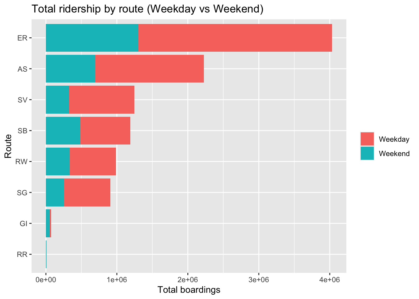
```
Total boardings are highest on East River (ER) and Astoria (AS).
```{r}
ggplot(route_avg_weekpart,
       aes(x = reorder(route_no, avg_boardings_per_trip, FUN = max),
           y = avg_boardings_per_trip, fill = day_type)) +
  geom_col(position = position_dodge(width = 0.8), width = 0.75) +
  coord_flip() +
  labs(x = "Route", y = "Avg boardings per trip", fill = NULL,
       title = "Average ridership per trip by route (Weekday vs Weekend)")
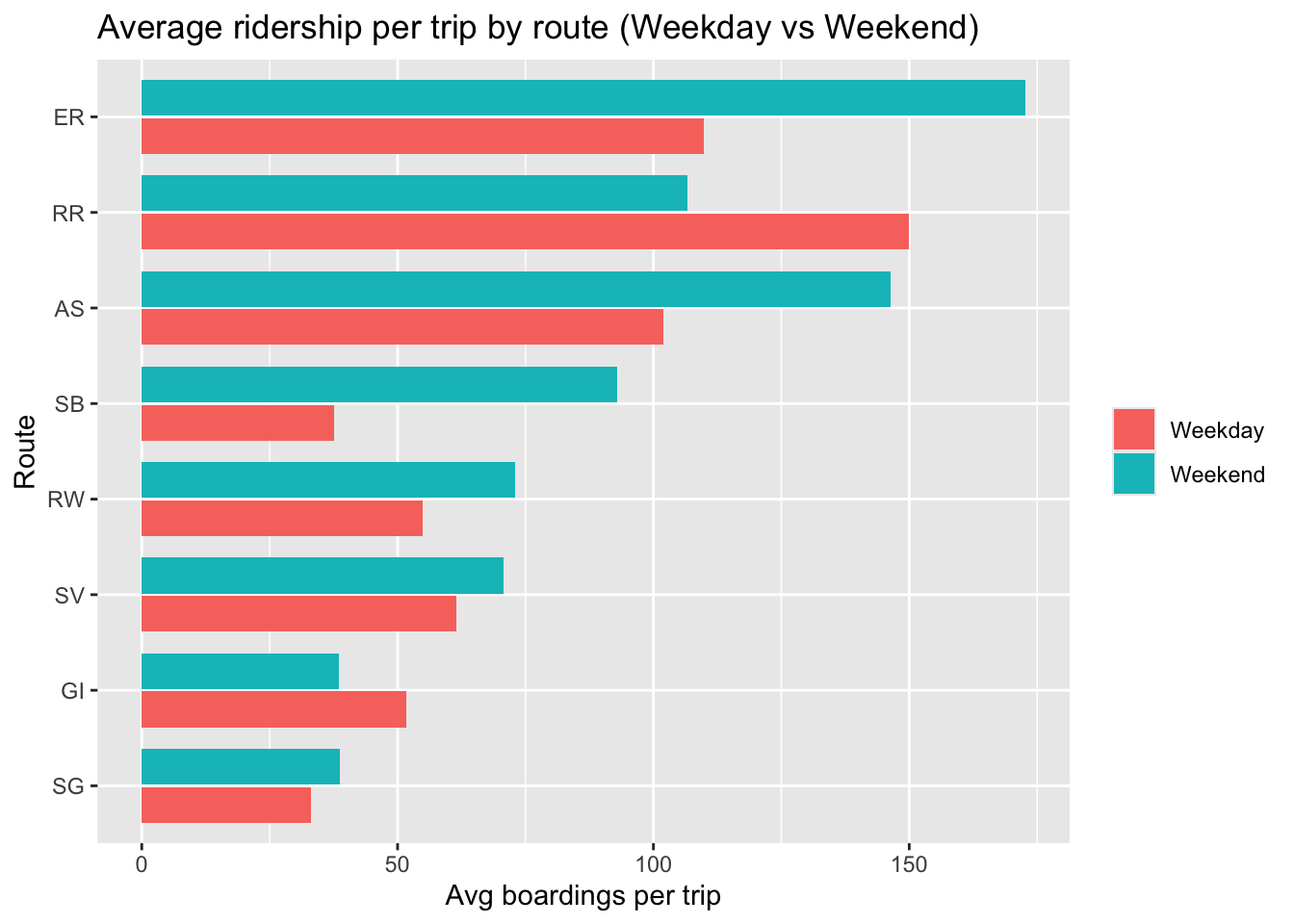
```
Average boardings per trip tend to be higher on weekends than weekdays. For the seasonal routes, weekday averages can appear high because weekday service days are holiday/peak-operation days.
#### Monthly figures
Monthly charts provide a high-level view of seasonality and temporal shifts in trips, total ridership, and average ridership per trip.
```{r}
ggplot(monthly_weekpart, aes(x = month, y = total_boardings, fill = day_type)) +
  geom_col(position = "stack") +
  scale_x_date(date_breaks = "1 month", date_labels = "%Y-%m") +
  labs(x = NULL, y = "Total boardings", fill = NULL,
       title = "Monthly ridership (Weekday vs Weekend)") +
  theme(axis.text.x = element_text(angle = 60, hjust = 1))
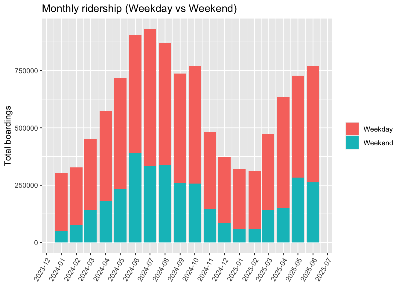
```
Ridership varies much more strongly by season than trips do, especially on weekends.
#### Time-of-day figures
Time-of-day plots show how ridership and activity vary across hours.
```{r}
ggplot(hour_weekpart, aes(x = dep_hour, y = total_boardings, fill = day_type)) +
  geom_col(position = "stack") +
  scale_x_continuous(breaks = hour_breaks) +
  scale_y_continuous(labels = scales::comma) +
  labs(title = "Total ridership by trip departure hour (Weekday vs Weekend)",
       x = "Departure hour", y = "Total boardings", fill = NULL)
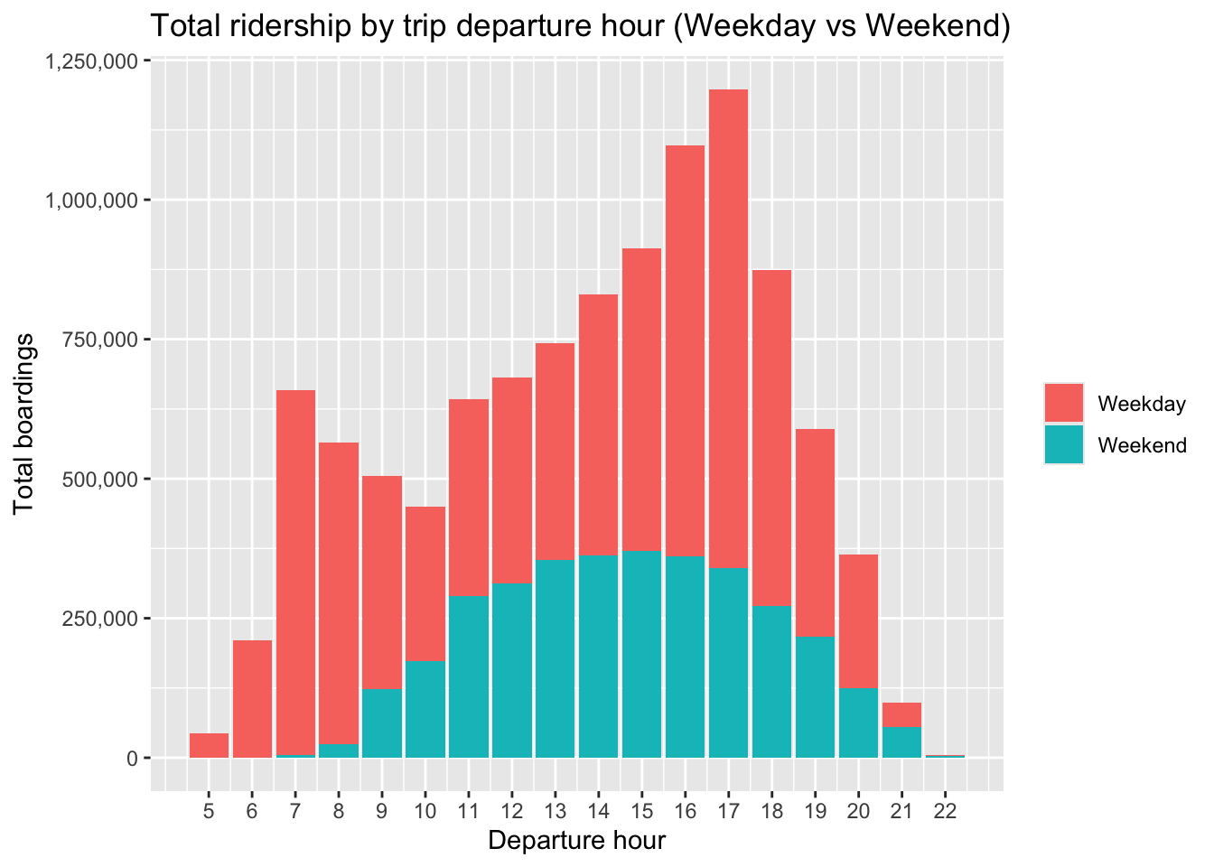
```
On weekdays, stop activity shows morning and evening peaks consistent with commuting patterns. On weekends, higher activity is concentrated from midday through early evening.
#### Distributions
Distribution plots are used as diagnostics to understand skew, outliers, and reasonable ranges for modeling. These figures are intended to guide feature engineering and robustness checks.
```{r}
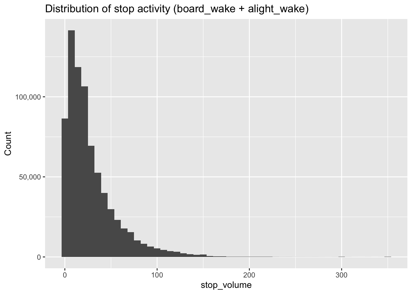
ggplot(dist_dat %>% filter(!is.na(stop_volume), stop_volume >= 0, stop_volume <= 350),
       aes(x = stop_volume)) +
  geom_histogram(bins = 50) +
  scale_y_continuous(labels = scales::comma) +
  labs(title = "Distribution of stop activity (board_wake + alight_wake)",
       x = "stop_volume", y = "Count")
```
Stop activity is highly right-skewed: most stops have relatively low combined boardings/alightings, while a small number of high-activity stops drive the upper tail. The majority of observations are below ~50 per stop.
#### Late-rate figures
These figures visualize how late rate varies across routes, months, and hours.
```{r}
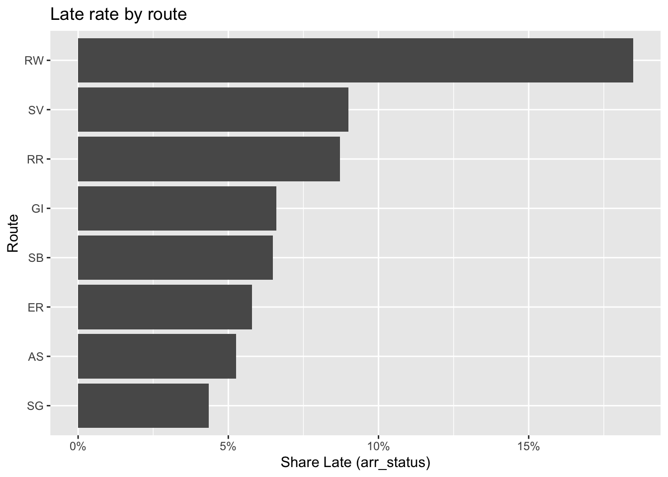
ggplot(late_by_route, aes(x = reorder(route_no, pct_late), y = pct_late)) +
  geom_col() +
  coord_flip() +
  scale_y_continuous(labels = scales::percent_format()) +
  labs(title = "Late rate by route", x = "Route", y = "Share Late (arr_status)")
```
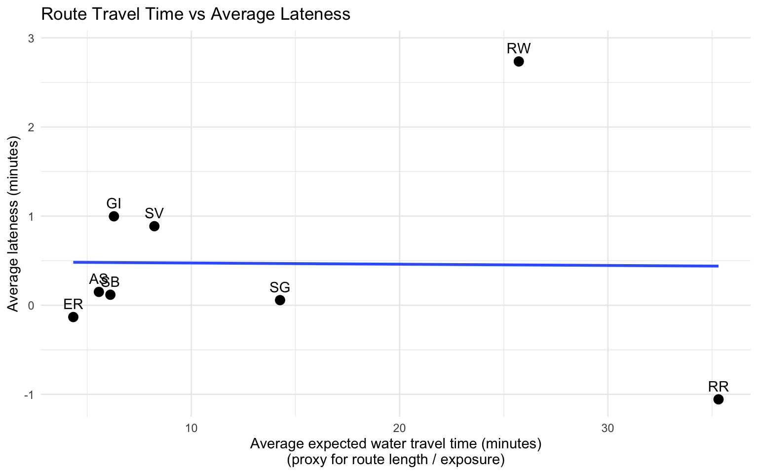
Rockaway (RW) has the highest late rate by a wide margin relative to other routes. It is the longest route and more exposed to high seasonal peaks and variable marine conditions.
```{r}
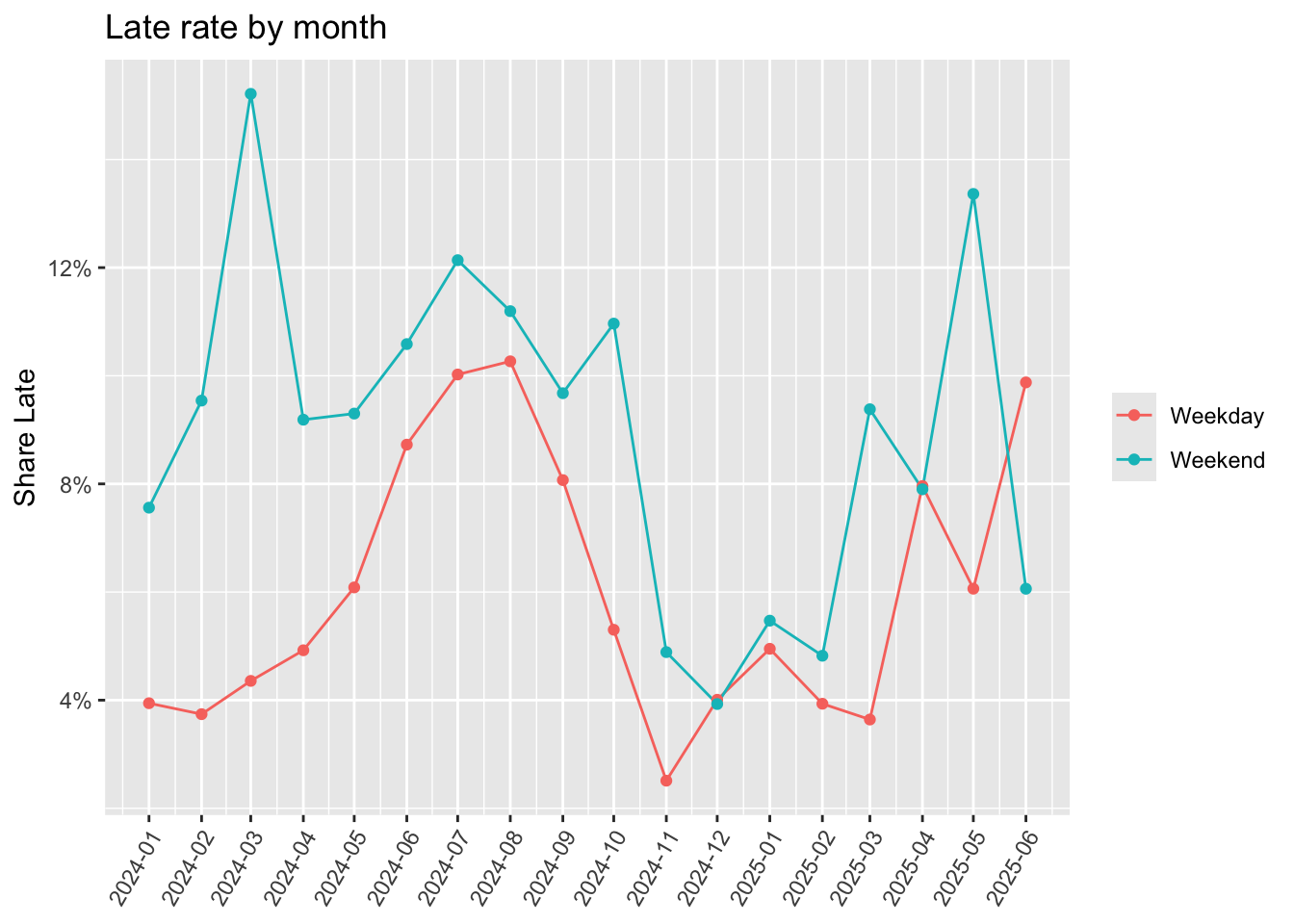
ggplot(late_by_month, aes(x = month, y = pct_late, color = day_type)) +
  geom_line() +
  geom_point() +
  scale_x_date(date_breaks = "1 month", date_labels = "%Y-%m") +
  scale_y_continuous(labels = scales::percent_format()) +
  labs(title = "Late rate by month", x = NULL, y = "Share Late", color = NULL) +
  theme(axis.text.x = element_text(angle = 60, hjust = 1))
```
Late rates are generally higher in summer than winter, and higher on weekends than weekdays.
```{r}
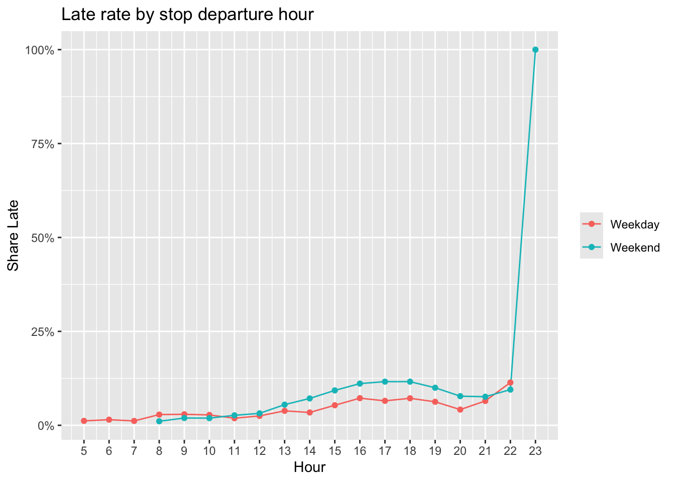
ggplot(late_by_hour, aes(x = dep_hour, y = pct_late, color = day_type)) +
  geom_line() +
  geom_point() +
  scale_x_continuous(breaks = late_hour_breaks) +
  scale_y_continuous(labels = scales::percent_format()) +
  labs(title = "Late rate by stop departure hour", x = "Hour", y = "Share Late", color = NULL)
```
Late rates tend to peak in the afternoon.
#### Late propagation proxy figures
To proxy delay propagation along a trip, we relate a stop's lateness to conditions at the previous stop. We show late rates binned by previous-stop dwell time and by previous-stop passenger activity.
```{r}
prev_dat <- dist_dat %>%
  arrange(trip_date, route_no, route_direction, trip_no, Stop_Sequence) %>%
  group_by(trip_date, route_no, route_direction, trip_no) %>%
  mutate(
    prev_dwell_min   = lag(dwell_min),
    prev_stop_volume = lag(stop_volume)
  ) %>%
  ungroup() %>%
  filter(!is.na(arr_status),
         !is.na(prev_dwell_min), prev_dwell_min >= 0, prev_dwell_min <= 60,
         !is.na(prev_stop_volume), prev_stop_volume >= 0)
```
```{r}
prev_dwell_late_tbl <- prev_dat %>%
  mutate(
    prev_dwell_bin = cut(prev_dwell_min,
                         breaks = c(0, 1, 2, 3, 5, 8, 12, 16, Inf),
                         include.lowest = TRUE)
  ) %>%
  group_by(prev_dwell_bin) %>%
  summarise(n = n(), pct_late = mean(arr_status == "Late", na.rm = TRUE), .groups = "drop")

prev_dwell_late_tbl
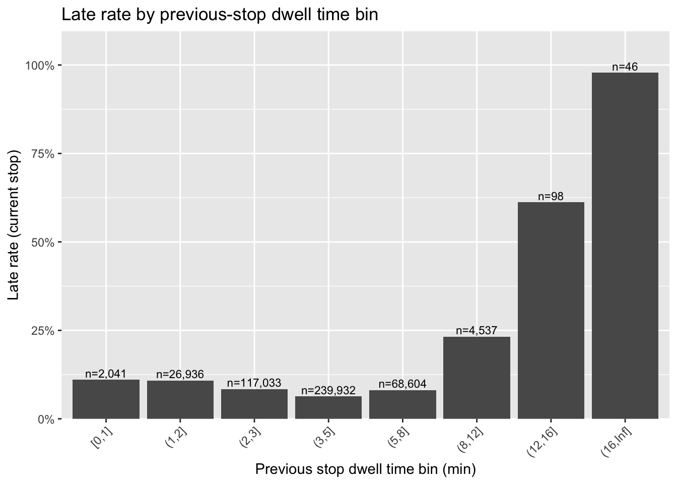
ggplot(prev_dwell_late_tbl, aes(x = prev_dwell_bin, y = pct_late)) +
  geom_col() +
  geom_text(aes(label = paste0("n=", scales::comma(n))), vjust = -0.3, size = 3) +
  scale_y_continuous(labels = scales::percent_format(), expand = expansion(mult = c(0, 0.12))) +
  labs(title = "Late rate by previous-stop dwell time bin",
       x = "Previous stop dwell time bin (min)", y = "Late rate (current stop)") +
  theme(axis.text.x = element_text(angle = 45, hjust = 1))
```
Within typical dwell time ranges, the relationship between previous-stop dwell and current-stop late rate is relatively weak. Once previous-stop dwell becomes unusually long (e.g., > ~8 minutes), late rates increase sharply.
```{r}
prev_vol_late_tbl <- prev_dat %>%
  mutate(
    prev_vol_bin = cut(prev_stop_volume,
                       breaks = c(0, 10, 20, 30, 50, 100, 150, 200, Inf),
                       include.lowest = TRUE)
  ) %>%
  group_by(prev_vol_bin) %>%
  summarise(n = n(), pct_late = mean(arr_status == "Late", na.rm = TRUE), .groups = "drop")

prev_vol_late_tbl
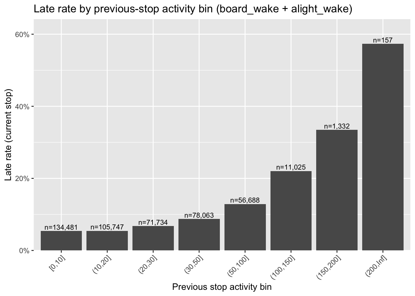
ggplot(prev_vol_late_tbl, aes(x = prev_vol_bin, y = pct_late)) +
  geom_col() +
  geom_text(aes(label = paste0("n=", scales::comma(n))), vjust = -0.3, size = 3) +
  scale_y_continuous(labels = scales::percent_format(), expand = expansion(mult = c(0, 0.12))) +
  labs(title = "Late rate by previous-stop activity bin (board_wake + alight_wake)",
       x = "Previous stop activity bin", y = "Late rate (current stop)") +
  theme(axis.text.x = element_text(angle = 45, hjust = 1))
```
When previous-stop activity is moderate, late rates change gradually; beyond higher activity levels (e.g., > ~50), late rates rise more noticeably.
Taken together, these patterns suggest that delay is driven less by commuter peaks and more by high-demand recreational periods, particularly on routes serving waterfront leisure destinations.
```{r}
#| eval: false
export_dir <- "../exploratory_code/ridership_eda"
readr::write_csv(dat, file.path(export_dir, "dat_stops_2024-01-01_2025-06-30_drop0425SB.csv.gz"))
saveRDS(dat, file.path(export_dir, "dat_stops_2024-01-01_2025-06-30_drop0425SB.rds"))
```
### Operational Analysis
**By: Guangze 'Simon' Sun and Yiming 'Ming' Cao**
This operational EDA complements the associative model by examining how ferry delay is recorded, decomposed, generated, and recovered. The four sections ask what issues are recorded in trip notes, how stop-level delay can be decomposed, where large delays are observed versus generated upstream, and whether inherited delay can be absorbed before the next trip begins.
```{r}
#| message: false
#| warning: false
trip_files <- c(
  "../exploratory_code/ridership_eda/NYCF_trip_data_2024.csv",
  "../exploratory_code/ridership_eda/NYCF_trip_data_2025.01_06.csv"
)
decomp_file <- "../exploratory_code/modeling/stop_level_arrival_decomposition_table_corrected_second_stop.csv"

accent       <- "#1A9988"
gold         <- "#F2C14E"
coral        <- "#D95F59"
blue         <- "#7BA7C7"
muted_palette <- c(
  "Inherited previous-trip delay" = "#1A9988",
  "Carried within-trip delay"     = "#F2C14E",
  "Upstream landside delay"       = "#7BA7C7",
  "Upstream waterside delay"      = "#D95F59"
)
plot_theme <- theme_minimal(base_size = 14) +
  theme(
    plot.title    = element_text(face = "bold", size = 17),
    panel.grid.minor = element_blank(),
    legend.title  = element_blank(),
    axis.text     = element_text(color = "#333333")
  )

fmt_pct <- function(x) percent(x, accuracy = 0.1)
clean_kable <- function(x, caption = NULL, align = NULL) {
  if (is.null(align)) {
    align <- paste0(if_else(map_lgl(x, is.character), "l", "r"), collapse = "")
  }
  kable(x, caption = caption, align = align)
}
```
#### Text Analysis
Trip notes were extracted from raw NYC Ferry trip-level files and parsed into standardized categories. One trip can have multiple categories, so category shares are presence rates rather than mutually exclusive percentages. Results are descriptive associations, not causal effects.
```{r text-analysis}
parse_note_segments <- function(trip_uid, note_text) {
  note_text <- ifelse(is.na(note_text), "", note_text)
  if (str_trim(note_text) == "") return(tibble(trip_uid = integer(), category = character(), description = character()))
  matches <- str_match_all(note_text, "\\[(\\d+)\\]\\s*([^:\\[]+):\\s*([^\\[]*)")[[1]]
  if (nrow(matches) == 0) return(tibble(trip_uid = trip_uid, category = "Unparsed", description = note_text))
  tibble(trip_uid = trip_uid, category = matches[, 3], description = matches[, 4])
}

clean_category <- function(x) {
  out <- str_squish(x) %>% str_replace_all("\\s+", " ") %>% str_to_title()
  dplyr::recode(out, "Uscg Restriction" = "USCG Restriction", "Nyc Ferry" = "NYC Ferry", "Ny Waterway" = "NY Waterway", .default = out)
}

raw_trips <- map_dfr(trip_files, ~ read_csv(.x, show_col_types = FALSE) %>% mutate(source_file = basename(.x))) %>%
  select(-matches("^\\.\\.\\."))

trips <- raw_trips %>%
  mutate(
    trip_uid = row_number(),
    route = if ("route_no" %in% names(.)) route_no else NA_character_,
    service_date = if ("trip_date" %in% names(.)) mdy(trip_date) else as.Date(NA),
    note_text = coalesce(notes, ""),
    scheduled_arrival_ts = mdy_hm(scheduled_arrival_dt, quiet = TRUE),
    actual_arrival_ts    = mdy_hm(actual_arrival_dt,    quiet = TRUE),
    arrival_delay_min_raw = as.numeric(difftime(actual_arrival_ts, scheduled_arrival_ts, units = "mins")),
    status_text = str_squish(str_c(coalesce(trip_status, ""), coalesce(trip_status_actual, ""), sep = " | ")),
    cancelled            = str_detect(str_to_lower(status_text), "trip not completed|cancel") | coalesce(`(16) Trip Cancelled`, FALSE),
    partial_completion   = str_detect(str_to_lower(status_text), "partial") | coalesce(`(17) Partially Completed`, FALSE),
    cancel_or_partial_completion = cancelled | partial_completion,
    completed_trip = !cancel_or_partial_completion & (str_detect(str_to_lower(status_text), "completed") | coalesce(`(10)  Completed`, FALSE)),
    valid_delay         = completed_trip & !is.na(arrival_delay_min_raw),
    delayed_5           = valid_delay & arrival_delay_min_raw > 5,
    excessive_delay_10  = valid_delay & arrival_delay_min_raw > 10
  )

note_segments <- map2_dfr(trips$trip_uid, trips$note_text, parse_note_segments) %>%
  mutate(category = clean_category(category), description = str_squish(description)) %>%
  filter(!is.na(category), category != "")

trip_category <- note_segments %>%
  distinct(trip_uid, category) %>%
  left_join(trips %>% select(trip_uid, route, service_date, note_text, arrival_delay_min_raw,
                             delayed_5, excessive_delay_10, cancel_or_partial_completion), by = "trip_uid") %>%
  filter(category != "Completed")

category_presence <- trip_category %>%
  group_by(category) %>%
  summarise(
    n_trips_with_category = n_distinct(trip_uid),
    share_all_trips = n_trips_with_category / nrow(trips),
    share_among_delayed_5 = n_distinct(trip_uid[delayed_5]) / sum(trips$delayed_5, na.rm = TRUE),
    share_among_excessive_delay_10 = n_distinct(trip_uid[excessive_delay_10]) / sum(trips$excessive_delay_10, na.rm = TRUE),
    share_among_cancel_or_partial_completion = n_distinct(trip_uid[cancel_or_partial_completion]) / sum(trips$cancel_or_partial_completion, na.rm = TRUE),
    .groups = "drop"
  ) %>%
  arrange(desc(pmax(share_among_excessive_delay_10, share_among_cancel_or_partial_completion, na.rm = TRUE)))

category_rates <- trip_category %>%
  group_by(category) %>%
  summarise(
    n_trips_with_category = n_distinct(trip_uid),
    delayed_5_rate = mean(delayed_5, na.rm = TRUE),
    excessive_delay_10_rate = mean(excessive_delay_10, na.rm = TRUE),
    cancel_or_partial_completion_rate = mean(cancel_or_partial_completion, na.rm = TRUE),
    .groups = "drop"
  ) %>%
  arrange(desc(pmax(excessive_delay_10_rate, cancel_or_partial_completion_rate, na.rm = TRUE)))

support_threshold <- if_else(sum(category_rates$n_trips_with_category >= 50) >= 8, 50, 20)

presence_display <- category_presence %>%
  slice_head(n = 12) %>%
  transmute(
    Category = category,
    `All trips` = fmt_pct(share_all_trips),
    `Delay >5` = fmt_pct(share_among_delayed_5),
    `Delay >10` = fmt_pct(share_among_excessive_delay_10),
    `Cancel / partial` = fmt_pct(share_among_cancel_or_partial_completion)
  )

rates_display <- category_rates %>%
  filter(n_trips_with_category >= support_threshold) %>%
  slice_head(n = 12) %>%
  transmute(
    Category = category,
    Trips = n_trips_with_category,
    `Delay >5 rate` = fmt_pct(delayed_5_rate),
    `Delay >10 rate` = fmt_pct(excessive_delay_10_rate),
    `Cancel / partial rate` = fmt_pct(cancel_or_partial_completion_rate)
  )
```
```{r text-tables}
clean_kable(presence_display, caption = "Category presence among outcome groups", align = "lrrrr")
clean_kable(rates_display, caption = paste0("Outcome rates when category appears (support threshold n >= ", support_threshold, ")"), align = "lrrrr")
```
The first table shows which note categories appear most often among delayed or cancelled/partially completed trips. The second table flips the question: when a category appears, how often is that trip associated with delay or cancellation?
Passenger delays and marine traffic are the most visible delay-associated note categories, but they point to different mechanisms. Passenger delays become especially concentrated among delay >10 trips, while marine traffic is more prominent in the broader delay >5 group. Rare categories such as vessel mechanical issues, weather, and USCG restrictions appear less often overall but have high disruption rates when they occur, making them operationally important despite their low frequency.
#### Delay Decomposition
This is a median-based expected-time decomposition. A stop-level delay is decomposed into inherited previous-trip delay, carried within-trip delay, upstream landside delay, upstream waterside delay, and upstream wait when available. Vessel chains are reconstructed by vessel and operational sequence; consecutive trips by the same vessel are linked when they are operationally continuous. This is accounting/decomposition, not causal inference.
```{r decomposition}
decomp <- read_csv(decomp_file, show_col_types = FALSE)
component_cols <- c("inherited_prev_trip_delay", "carried_within_trip_delay", "upstream_landside_delay", "upstream_waterside_delay", "upstream_wait")
display_components <- c("inherited_prev_trip_delay", "carried_within_trip_delay", "upstream_landside_delay", "upstream_waterside_delay")
component_labels <- c(
  inherited_prev_trip_delay = "Inherited previous-trip delay",
  carried_within_trip_delay = "Carried within-trip delay",
  upstream_landside_delay   = "Upstream landside delay",
  upstream_waterside_delay  = "Upstream waterside delay",
  upstream_wait             = "Upstream wait"
)

eligible <- decomp %>%
  mutate(eligible_flag = eligible_arrival_decomp %in% c(TRUE, 1, "TRUE", "true", "1")) %>%
  filter(eligible_flag)

decomp_long <- eligible %>%
  mutate(`Delay >5` = arrival_delay_min > 5, `Delay >10` = arrival_delay_min > 10) %>%
  select(trip_key, stop_id, stop_sequence, `Delay >5`, `Delay >10`, all_of(component_cols)) %>%
  pivot_longer(all_of(component_cols), names_to = "component", values_to = "component_minutes") %>%
  mutate(Component = dplyr::recode(component, !!!component_labels), displayed = component %in% display_components)

decomp_groups <- bind_rows(
  decomp_long %>% filter(`Delay >5`)  %>% mutate(delay_group = "Delay >5"),
  decomp_long %>% filter(`Delay >10`) %>% mutate(delay_group = "Delay >10")
)

component_summary <- decomp_groups %>%
  group_by(delay_group, component, Component, displayed) %>%
  summarise(avg_min = mean(component_minutes, na.rm = TRUE),
            positive_avg_min = pmax(avg_min, 0), .groups = "drop") %>%
  group_by(delay_group) %>%
  mutate(share = if_else(displayed, positive_avg_min / sum(positive_avg_min[displayed], na.rm = TRUE), NA_real_)) %>%
  ungroup()

component_table_display <- component_summary %>%
  select(delay_group, Component, avg_min, share) %>%
  pivot_wider(names_from = delay_group, values_from = c(avg_min, share), names_glue = "{delay_group}_{.value}") %>%
  mutate(Component = factor(Component, levels = c("Inherited previous-trip delay", "Carried within-trip delay",
                                                   "Upstream landside delay", "Upstream waterside delay", "Upstream wait"))) %>%
  arrange(Component) %>%
  mutate(Component = as.character(Component)) %>%
  transmute(
    Component,
    `Delay >5 avg min`  = round(`Delay >5_avg_min`, 2),
    `Delay >5 share`    = if_else(is.na(`Delay >5_share`),  "—", fmt_pct(`Delay >5_share`)),
    `Delay >10 avg min` = round(`Delay >10_avg_min`, 2),
    `Delay >10 share`   = if_else(is.na(`Delay >10_share`), "—", fmt_pct(`Delay >10_share`))
  )

plot_components <- component_summary %>%
  filter(displayed) %>%
  mutate(Component = factor(Component, levels = rev(c("Inherited previous-trip delay", "Carried within-trip delay",
                                                       "Upstream landside delay", "Upstream waterside delay"))))

decomp_bar <- ggplot(plot_components, aes(x = delay_group, y = positive_avg_min, fill = Component)) +
  geom_col(width = 0.65) +
  scale_fill_manual(values = muted_palette) +
  labs(title = "Average Delay Components", x = NULL, y = "Average component minutes") +
  plot_theme
```
```{r decomposition-output}
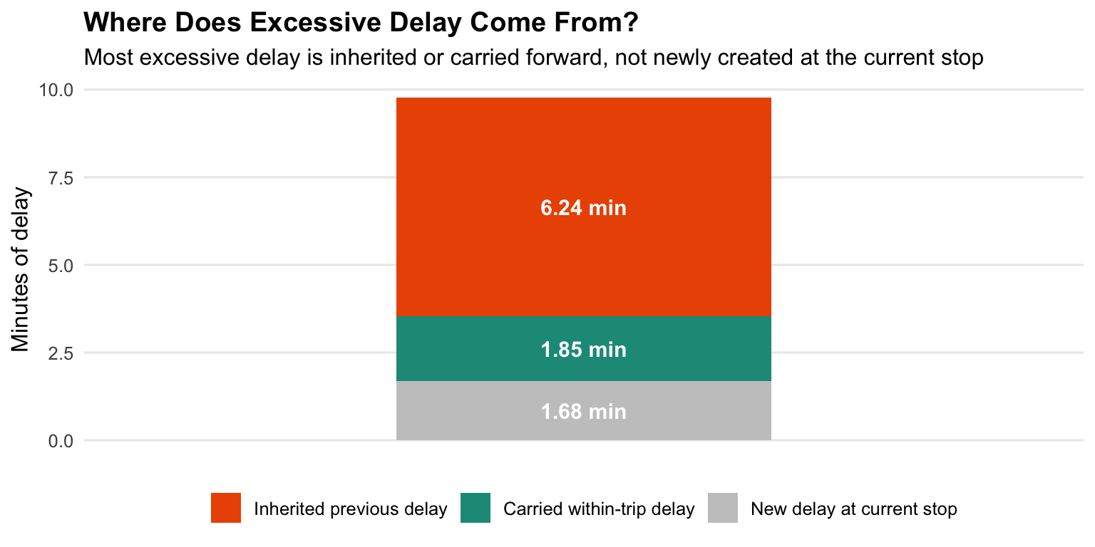
#| fig-cap: "Average component minutes among stop observations with delay greater than 5 or 10 minutes."
print(decomp_bar)
clean_kable(component_table_display, caption = "Average delay components and displayed-component shares", align = "lrrrr")
```
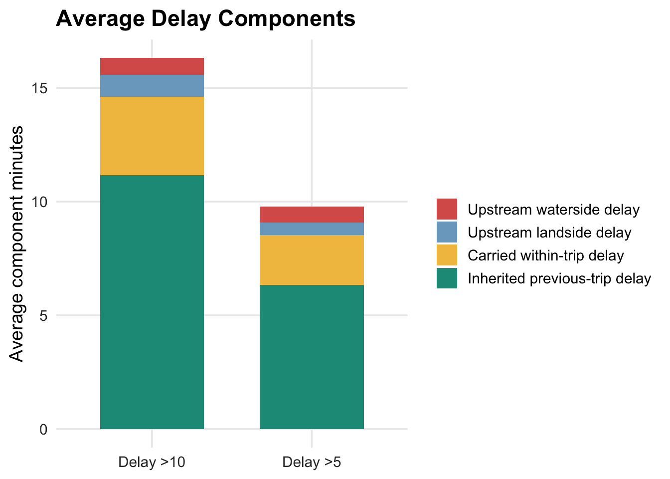
The decomposition shows that most delayed stop observations are not mainly created at the current stop or segment. Inherited previous-trip delay is the largest component in both groups, accounting for 64.7% of displayed component minutes among delay >5 observations and 68.4% among delay >10 observations. Carried within-trip delay is the second-largest component, contributing about one-fifth of displayed delay in both groups. Newly generated upstream landside and waterside components are much smaller on average.
The severity difference is also important. Delay >10 observations have much larger inherited delay than delay >5 observations, while the shares of landside and waterside delay remain comparatively small. This suggests that severe delay is often the result of propagation through the vessel chain rather than a local event at the delayed stop.
#### Delay Genesis
This section traces delayed stop observations backward through the same vessel chain. Targets use `arrival_delay_min > 5` and `arrival_delay_min > 10`. A major source is a single landside event greater than 5 minutes or a single waterside event greater than 5 minutes.
```{r genesis}
stop_label      <- if ("stop_name" %in% names(decomp)) "stop_name" else "stop_id"
prev_stop_label <- if ("prev_stop_name" %in% names(decomp)) "prev_stop_name" else "prev_stop_id"
vessel_col      <- if ("vessel_id" %in% names(decomp)) "vessel_id" else if ("vessel" %in% names(decomp)) "vessel" else NA_character_
if (is.na(vessel_col)) stop("A vessel identifier is required for delay genesis tracing.")

timeline0 <- decomp %>%
  mutate(
    scheduled_ts  = suppressWarnings(as.POSIXct(scheduled_time_original, tz = "America/New_York")),
    eligible_flag = eligible_arrival_decomp %in% c(TRUE, 1, "TRUE", "true", "1")
  )

trip_bounds <- timeline0 %>%
  group_by(.data[[vessel_col]], trip_key) %>%
  summarise(trip_start_ts = min(scheduled_ts, na.rm = TRUE),
            trip_end_ts   = max(scheduled_ts, na.rm = TRUE), .groups = "drop") %>%
  arrange(.data[[vessel_col]], trip_start_ts, trip_end_ts, trip_key) %>%
  group_by(.data[[vessel_col]]) %>%
  mutate(
    prev_trip_end_ts = lag(trip_end_ts),
    trip_gap_min     = as.numeric(difftime(trip_start_ts, prev_trip_end_ts, units = "mins")),
    chain_break      = is.na(trip_gap_min) | trip_gap_min > 30,
    vessel_chain_id  = paste(.data[[vessel_col]], cumsum(chain_break), sep = "_")
  ) %>%
  ungroup() %>%
  select(.data[[vessel_col]], trip_key, vessel_chain_id, trip_start_ts, trip_gap_min)

timeline <- timeline0 %>%
  left_join(trip_bounds, by = c(vessel_col, "trip_key")) %>%
  mutate(
    positive_landside_delay  = pmax(replace_na(upstream_landside_delay,  0), 0),
    positive_waterside_delay = pmax(replace_na(upstream_waterside_delay, 0), 0),
    observed_landing  = coalesce(as.character(.data[[stop_label]]),      as.character(stop_id)),
    source_from_landing = coalesce(as.character(.data[[prev_stop_label]]), as.character(prev_stop_id), "Origin"),
    source_to_landing = observed_landing,
    observed_segment  = paste(source_from_landing, "->", observed_landing),
    source_segment    = paste(source_from_landing, "->", observed_landing),
    row_top_generated_delay = pmax(positive_landside_delay, positive_waterside_delay),
    row_top_source_type = case_when(
      row_top_generated_delay <= 0 ~ NA_character_,
      positive_landside_delay >= positive_waterside_delay ~ "Landside",
      TRUE ~ "Waterside"
    ),
    major_landside  = positive_landside_delay  > 5,
    major_waterside = positive_waterside_delay > 5
  ) %>%
  arrange(vessel_chain_id, scheduled_ts, trip_start_ts, trip_key, stop_sequence) %>%
  group_by(vessel_chain_id) %>%
  mutate(
    row_order_within_chain       = row_number(),
    cumulative_positive_generated = cumsum(positive_landside_delay + positive_waterside_delay),
    cumulative_major_sources      = cumsum(major_landside) + cumsum(major_waterside)
  ) %>%
  ungroup()

top_source_by_chain <- function(chain_df) {
  chain_df <- chain_df %>% arrange(row_order_within_chain)
  best_delay <- numeric(nrow(chain_df)); best_type <- character(nrow(chain_df))
  best_landing <- character(nrow(chain_df)); best_segment <- character(nrow(chain_df))
  current_best <- 0; current_type <- NA_character_; current_landing <- NA_character_; current_segment <- NA_character_
  for (i in seq_len(nrow(chain_df))) {
    if (!is.na(chain_df$row_top_generated_delay[i]) && chain_df$row_top_generated_delay[i] > current_best) {
      current_best    <- chain_df$row_top_generated_delay[i]
      current_type    <- chain_df$row_top_source_type[i]
      current_landing <- chain_df$source_from_landing[i]
      current_segment <- chain_df$source_segment[i]
    }
    best_delay[i] <- current_best; best_type[i] <- current_type
    best_landing[i] <- current_landing; best_segment[i] <- current_segment
  }
  chain_df %>% mutate(
    top_source_generated_minutes = best_delay,
    top_source_type    = na_if(best_type, ""),
    top_source_landing = na_if(best_landing, ""),
    top_source_segment = na_if(best_segment, "")
  )
}

timeline <- timeline %>% group_split(vessel_chain_id) %>% map_dfr(top_source_by_chain)

observed_landing_den  <- timeline %>% filter(eligible_flag) %>% count(observed_landing,    name = "Observed total observations")
observed_segment_den  <- timeline %>% filter(eligible_flag) %>% count(observed_segment,    name = "Observed total observations")
generated_landing_den <- timeline %>% filter(eligible_flag) %>% count(source_from_landing, name = "Generated total source observations")
generated_segment_den <- timeline %>% filter(eligible_flag) %>% count(source_segment,      name = "Generated total source observations")

target_base <- timeline %>%
  filter(eligible_flag, arrival_delay_min > 5) %>%
  transmute(
    target_id_base = row_number(),
    observed_landing, observed_segment, arrival_delay_min,
    cumulative_positive_generated,
    num_major_sources        = cumulative_major_sources,
    top_source_generated_minutes,
    top_source_type, top_source_landing, top_source_segment,
    top_source_share = if_else(cumulative_positive_generated > 0,
                               top_source_generated_minutes / cumulative_positive_generated, NA_real_)
  )

genesis_targets <- bind_rows(
  target_base %>% mutate(delay_group = "delay_gt5",  delay_group_label = "Delay >5"),
  target_base %>% filter(arrival_delay_min > 10) %>% mutate(delay_group = "delay_gt10", delay_group_label = "Delay >10")
) %>%
  mutate(
    target_id    = paste(delay_group, target_id_base, sep = "_"),
    genesis_type = case_when(
      cumulative_positive_generated <= 0 | is.na(cumulative_positive_generated) ~ "No traced positive source",
      num_major_sources == 1 & top_source_share >= 0.5 ~ "Single major",
      num_major_sources >= 2 ~ "Multiple major",
      TRUE ~ "Cumulative"
    )
  )

classified_targets <- genesis_targets %>% filter(genesis_type %in% c("Single major", "Multiple major", "Cumulative"))

genesis_type_summary <- classified_targets %>%
  count(delay_group, delay_group_label, genesis_type, name = "n_targets") %>%
  group_by(delay_group) %>%
  mutate(share_of_classified_targets = n_targets / sum(n_targets)) %>%
  ungroup()

genesis_type_bar <- ggplot(genesis_type_summary, aes(x = delay_group_label, y = share_of_classified_targets, fill = genesis_type)) +
  geom_col(width = 0.65) +
  scale_y_continuous(labels = percent_format()) +
  scale_fill_manual(values = c("Single major" = accent, "Multiple major" = gold, "Cumulative" = blue)) +
  labs(title = "Delay Genesis Type", x = NULL, y = "Share of classified delayed observations") +
  plot_theme

top_source_event_summary <- classified_targets %>%
  count(delay_group, delay_group_label, top_source_type, name = "n_targets") %>%
  group_by(delay_group) %>%
  mutate(share_of_targets = n_targets / sum(n_targets)) %>%
  ungroup()

top_source_event_plot <- ggplot(top_source_event_summary, aes(x = delay_group_label, y = share_of_targets, fill = top_source_type)) +
  geom_col(width = 0.65) +
  scale_y_continuous(labels = percent_format()) +
  scale_fill_manual(values = c("Landside" = accent, "Waterside" = coral)) +
  labs(title = "Top Source Event Type", x = NULL, y = "Share of classified delayed observations") +
  plot_theme

make_location_tables <- function(geography = c("landing", "segment")) {
  geography   <- match.arg(geography)
  obs_col     <- if (geography == "landing") "observed_landing" else "observed_segment"
  gen_col     <- if (geography == "landing") "top_source_landing" else "top_source_segment"
  obs_den     <- if (geography == "landing") observed_landing_den else observed_segment_den
  gen_den     <- if (geography == "landing") generated_landing_den else generated_segment_den
  obs_den_col <- if (geography == "landing") "observed_landing" else "observed_segment"
  gen_den_col <- if (geography == "landing") "source_from_landing" else "source_segment"

  observed <- genesis_targets %>%
    filter(delay_group == "delay_gt5") %>%
    count(Location = .data[[obs_col]], name = "Observed delayed count") %>%
    left_join(rename(obs_den, Location = all_of(obs_den_col)), by = "Location") %>%
    mutate(`Observed delay rate` = `Observed delayed count` / `Observed total observations`)

  generated <- classified_targets %>%
    filter(delay_group == "delay_gt5", !is.na(.data[[gen_col]])) %>%
    count(Location = .data[[gen_col]], name = "Generated linked delay count") %>%
    left_join(rename(gen_den, Location = all_of(gen_den_col)), by = "Location") %>%
    mutate(`Generated source-linked rate` = `Generated linked delay count` / `Generated total source observations`)

  obs_support <- if (sum(observed$`Observed total observations` >= 100, na.rm = TRUE) >= 5) 100 else 50
  gen_support <- if (sum(generated$`Generated total source observations` >= 100, na.rm = TRUE) >= 5) 100 else 50

  count_table <- full_join(
    observed  %>% arrange(desc(`Observed delayed count`))       %>% mutate(Rank = row_number()) %>% slice_head(n = 5) %>% select(Rank, `Observed delay location` = Location, `Observed delayed count`),
    generated %>% arrange(desc(`Generated linked delay count`)) %>% mutate(Rank = row_number()) %>% slice_head(n = 5) %>% select(Rank, `Generated source location` = Location, `Generated linked delay count`),
    by = "Rank"
  ) %>% arrange(Rank)

  rate_table <- full_join(
    observed  %>% filter(`Observed total observations`        >= obs_support) %>% arrange(desc(`Observed delay rate`),         desc(`Observed delayed count`))       %>% mutate(Rank = row_number()) %>% slice_head(n = 5) %>% select(Rank, `Observed delay location` = Location, `Observed delayed count`, `Observed total observations`, `Observed delay rate`),
    generated %>% filter(`Generated total source observations` >= gen_support) %>% arrange(desc(`Generated source-linked rate`), desc(`Generated linked delay count`)) %>% mutate(Rank = row_number()) %>% slice_head(n = 5) %>% select(Rank, `Generated source location` = Location, `Generated linked delay count`, `Generated total source observations`, `Generated source-linked rate`),
    by = "Rank"
  ) %>% arrange(Rank)

  list(count = count_table, rate = rate_table)
}

landing_gt5 <- make_location_tables("landing")
segment_gt5 <- make_location_tables("segment")
```
```{r genesis-output}
#| fig-cap: "Genesis types among classified delayed observations."
print(genesis_type_bar)
```
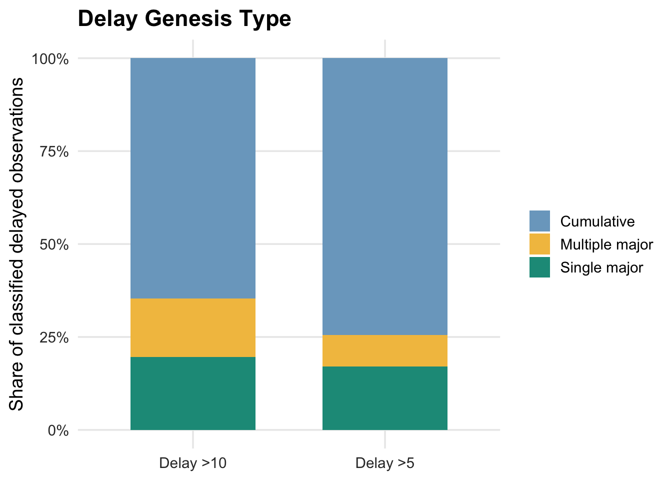
Most delayed observations are classified as cumulative rather than being explained by one large source event. This is especially true for the broader delay >5 group. For delay >10 observations, the share of single-major and multiple-major cases increases, indicating that severe delays are more likely to involve at least one large upstream landside or waterside increment.
```{r genesis-event-output}
#| fig-cap: "Top source event type for classified delayed observations."
print(top_source_event_plot)
```
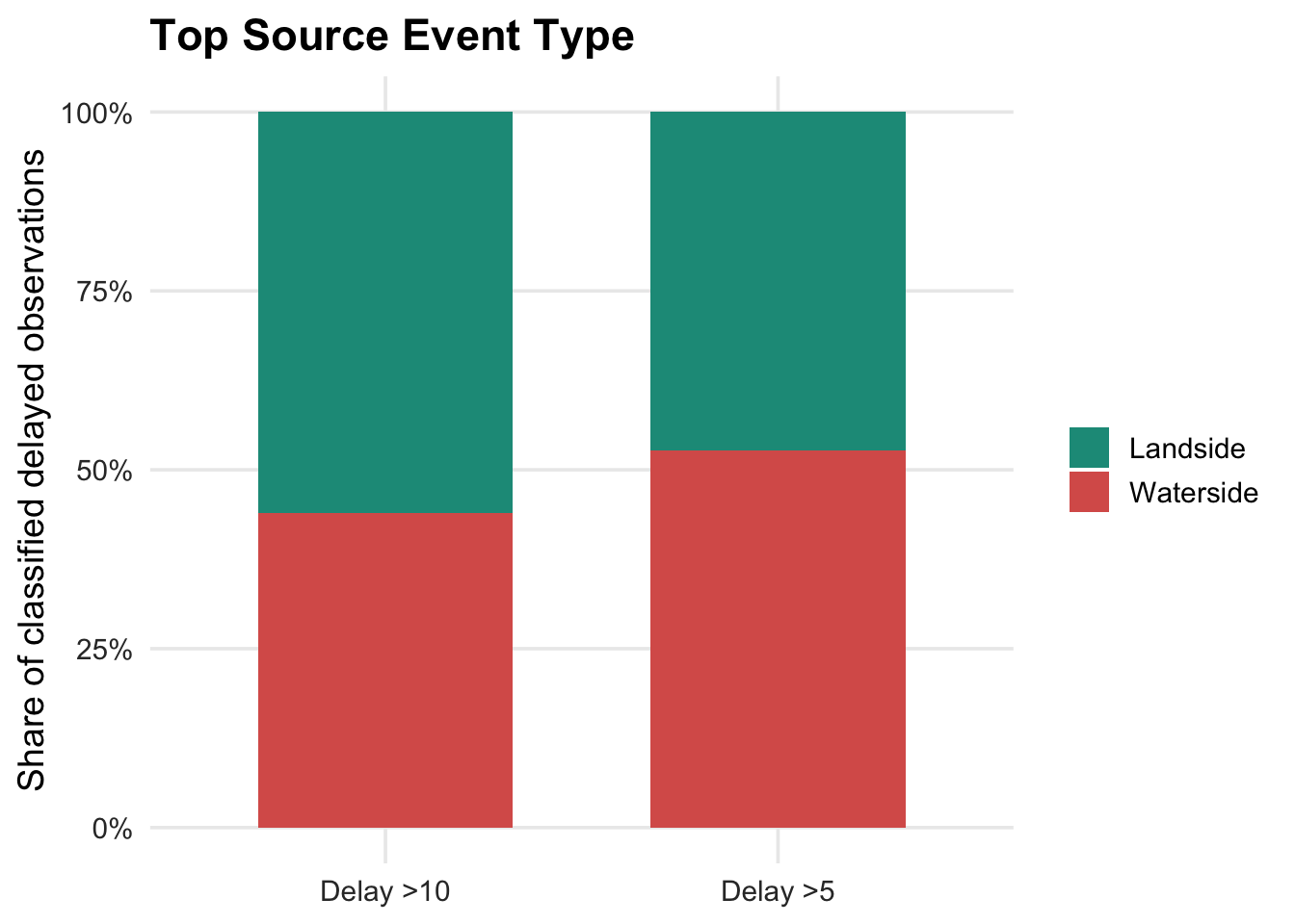
For delay >5 observations, top source events are roughly balanced, with waterside sources slightly more prominent. For delay >10 observations, the split shifts more toward landside sources, suggesting that the most severe traced delays may be more connected to landing, dwell, boarding, or turnaround-related processes at the upstream source location.
**Observed versus generated locations.** The observed-location tables show where delays appear if we only look at delayed arrivals. The generated-source tables show where the top traced source events occur after applying the decomposition logic.
```{r genesis-location-tables}
format_rate_table <- function(x) {
  x %>% mutate(
    `Observed delay rate`       = fmt_pct(`Observed delay rate`),
    `Generated source-linked rate` = fmt_pct(`Generated source-linked rate`)
  )
}

clean_kable(landing_gt5$count %>% rename(`Observed delay landing` = `Observed delay location`, `Generated source landing` = `Generated source location`), caption = "Delay >5 landing comparison by count", align = "rlrlr")
clean_kable(format_rate_table(landing_gt5$rate) %>% rename(`Observed delay landing` = `Observed delay location`, `Generated source landing` = `Generated source location`), caption = "Delay >5 landing comparison by local rate", align = "rlrrlrrr")
clean_kable(segment_gt5$count %>% rename(`Observed delay segment` = `Observed delay location`, `Generated source segment` = `Generated source location`), caption = "Delay >5 segment comparison by count", align = "rlrlr")
clean_kable(format_rate_table(segment_gt5$rate) %>% rename(`Observed delay segment` = `Observed delay location`, `Generated source segment` = `Generated source location`), caption = "Delay >5 segment comparison by local rate", align = "rlrrlrrr")
```
The count-based location tables show that the places where delay is observed are not always the same as the places where delay is generated. Wall St/Pier 11 and East 34th Street are major observed delay locations by count, given their central role in the network. However, the generated-source rankings shift attention upstream to locations such as East 90th St and Hunters Point South. The rate-based tables identify locations that are delay-prone relative to their own activity volume — useful for diagnosing reliability risk at a specific landing or segment.
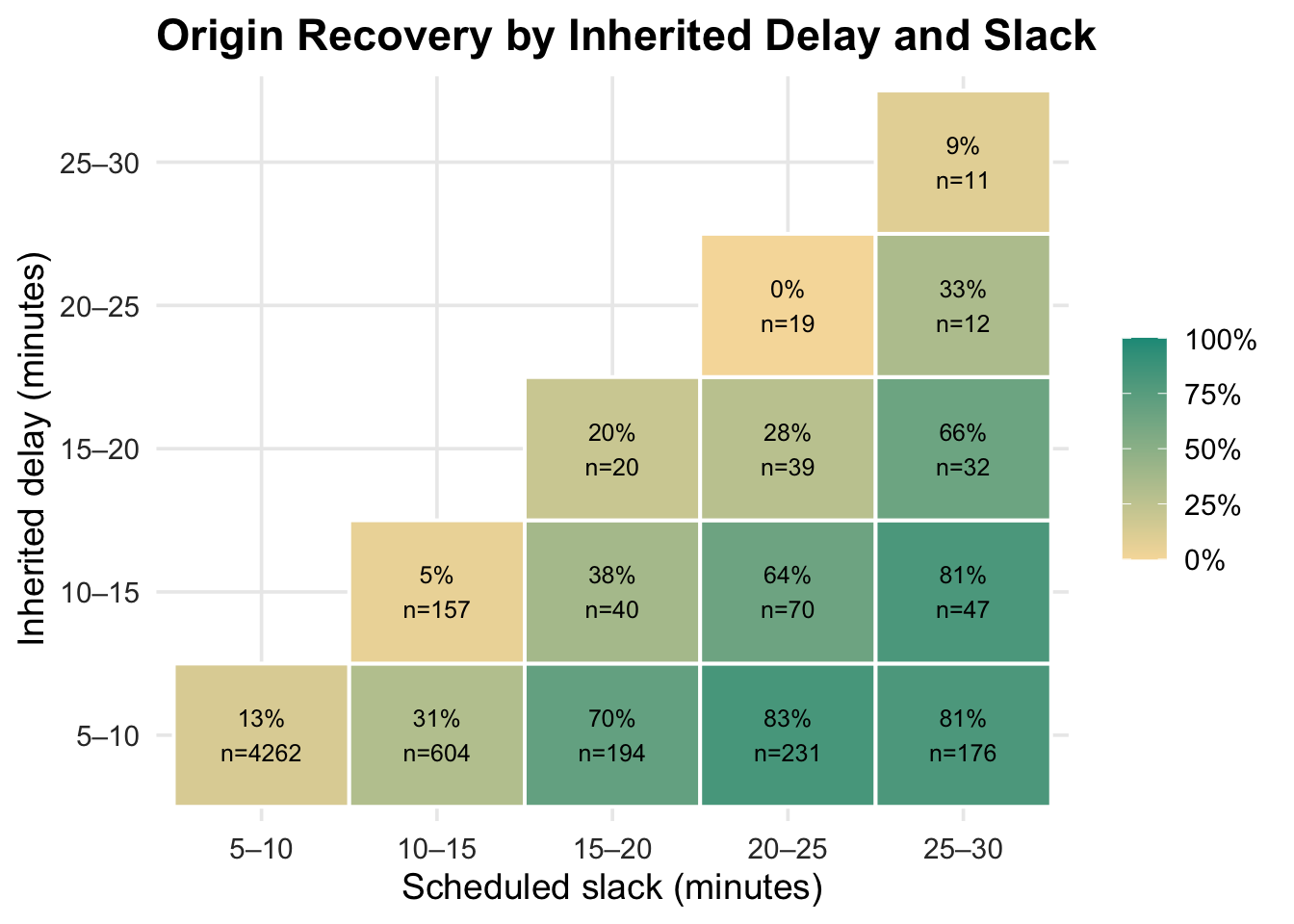
#### Delay Recovery
This section focuses only on trip pairs where the next trip inherits more than 5 minutes of delay. Origin recovery means the next trip departs within 1 minute of the median-based expected departure time. Scheduled slack is recomputed as current trip scheduled origin time minus the previous trip terminal scheduled time for the same vessel.
```{r recovery}
terminal_rows <- decomp %>%
  group_by(trip_key) %>%
  slice_max(order_by = stop_sequence, n = 1, with_ties = FALSE) %>%
  ungroup() %>%
  transmute(trip_key, terminal_scheduled_time_original = scheduled_time_original)

origin_context <- decomp %>%
  group_by(trip_key) %>%
  slice_min(order_by = stop_sequence, n = 1, with_ties = FALSE) %>%
  ungroup() %>%
  transmute(
    trip_key, trip_date = trip_date_et, route_id, direction, vessel_id,
    schedule_daytype, schedule_season,
    origin_scheduled_time_original = prev_stop_scheduled_time_original,
    origin_departure_delay_total, inherited_prev_trip_delay
  )

recovery_pairs_recomputed <- origin_context %>%
  left_join(terminal_rows, by = "trip_key") %>%
  arrange(vessel_id, origin_scheduled_time_original, terminal_scheduled_time_original, trip_key) %>%
  group_by(vessel_id) %>%
  mutate(
    previous_terminal_scheduled_time_original = lag(terminal_scheduled_time_original),
    planned_turnaround_gap_min = as.numeric(difftime(origin_scheduled_time_original,
                                                      previous_terminal_scheduled_time_original, units = "mins"))
  ) %>%
  ungroup() %>%
  mutate(
    inherited_prev_trip_delay     = pmax(as.numeric(inherited_prev_trip_delay), 0, na.rm = FALSE),
    origin_departure_delay_total  = as.numeric(origin_departure_delay_total),
    origin_recovered_1min         = origin_departure_delay_total <= 1,
    origin_recovered_minutes      = inherited_prev_trip_delay - origin_departure_delay_total
  )

inherit_levels <- c("5–10", "10–15", "15–20", "20–25", "25–30", "30+")
slack_levels   <- c("5–10", "10–15", "15–20", "20–25", "25–30")
mask_lookup <- tibble(
  inherited_delay_bin = factor(inherit_levels, levels = inherit_levels),
  inherited_floor     = c(5, 10, 15, 20, 25, 30)
) %>%
  crossing(tibble(slack_bin = factor(slack_levels, levels = slack_levels), slack_ceiling = c(10, 15, 20, 25, 30))) %>%
  mutate(display_cell = inherited_floor < slack_ceiling)

recovery_base <- recovery_pairs_recomputed %>%
  mutate(
    inherited_delay = inherited_prev_trip_delay,
    slack           = planned_turnaround_gap_min,
    origin_recovered = origin_recovered_1min,
    inherited_delay_bin = case_when(
      inherited_delay <= 10 ~ "5–10",  inherited_delay <= 15 ~ "10–15",
      inherited_delay <= 20 ~ "15–20", inherited_delay <= 25 ~ "20–25",
      inherited_delay <= 30 ~ "25–30", TRUE ~ "30+"
    ),
    slack_bin = case_when(
      slack <= 10 ~ "5–10",  slack <= 15 ~ "10–15",
      slack <= 20 ~ "15–20", slack <= 25 ~ "20–25",
      slack <= 30 ~ "25–30", TRUE ~ NA_character_
    )
  ) %>%
  filter(inherited_delay > 5, !is.na(slack), slack >= 5, slack <= 30, !is.na(origin_recovered))

recovery_heatmap_data <- recovery_base %>%
  mutate(inherited_delay_bin = factor(inherited_delay_bin, levels = inherit_levels),
         slack_bin           = factor(slack_bin,           levels = slack_levels)) %>%
  group_by(inherited_delay_bin, slack_bin) %>%
  summarise(
    n = n(),
    origin_recovery_rate          = mean(origin_recovered,         na.rm = TRUE),
    median_inherited_delay        = median(inherited_delay,        na.rm = TRUE),
    median_slack                  = median(slack,                  na.rm = TRUE),
    median_origin_departure_delay = median(origin_departure_delay_total, na.rm = TRUE),
    .groups = "drop"
  ) %>%
  left_join(mask_lookup, by = c("inherited_delay_bin", "slack_bin")) %>%
  filter(display_cell)

recovery_heatmap <- ggplot(recovery_heatmap_data,
                           aes(x = slack_bin, y = inherited_delay_bin, fill = origin_recovery_rate)) +
  geom_tile(color = "white", linewidth = 0.7) +
  geom_text(aes(label = paste0(percent(origin_recovery_rate, accuracy = 1), "\n", "n=", n)), size = 3.3) +
  scale_fill_gradient(low = "#F6DCA8", high = accent, labels = percent_format(), limits = c(0, 1)) +
  labs(title = "Origin Recovery by Inherited Delay and Slack",
       x = "Scheduled slack (minutes)", y = "Inherited delay (minutes)", fill = "Recovered") +
  plot_theme

scatter_data <- recovery_pairs_recomputed %>%
  mutate(inherited_delay  = inherited_prev_trip_delay,
         slack            = planned_turnaround_gap_min,
         origin_recovered = origin_recovered_1min) %>%
  filter(inherited_delay > 5, !is.na(slack), slack >= 5, slack <= 30,
         inherited_delay <= 40, !is.na(origin_recovered))

recovery_scatter <- ggplot(scatter_data, aes(x = inherited_delay, y = slack, color = origin_recovered)) +
  geom_point(alpha = 0.3, size = 1.2) +
  coord_cartesian(ylim = c(5, 30), xlim = c(5, 40)) +
  scale_color_manual(values = c(`TRUE` = accent, `FALSE` = coral),
                     labels = c(`TRUE` = "Recovered", `FALSE` = "Not recovered")) +
  labs(title = "Origin Recovery Scatter",
       x = "Inherited delay (minutes)", y = "Scheduled slack (minutes)", color = NULL) +
  plot_theme
```
```{r recovery-output}
#| fig-cap: "Origin recovery among trips inheriting more than 5 minutes of delay."
print(recovery_heatmap)
print(recovery_scatter)
```
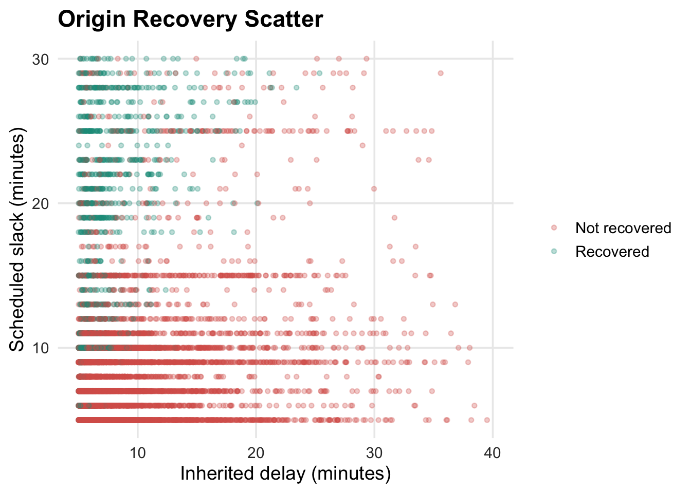
The recovery heatmap shows a clear interaction between inherited delay and scheduled slack. When inherited delay is only 5–10 minutes, recovery becomes much more likely as slack increases: recovery is 13% with 5–10 minutes of slack, 31% with 10–15 minutes, and reaches 70–83% once slack is above 15 minutes. The scatter plot confirms the heatmap pattern: recovered trips cluster where inherited delay is small and scheduled slack is large.
#### Conclusion
Together, these EDA modules show that ferry delay is operationally structured. Trip notes identify recurring disruption categories. The decomposition shows that delayed stop observations are dominated by inherited and carried delay rather than only newly generated local delay. Genesis tracing further shows that the place where delay is observed is not always the place where delay is generated; upstream landings and segments can create delay that is recorded later downstream. Finally, the recovery analysis shows that scheduled slack can absorb moderate inherited delay, but recovery becomes unlikely when inherited delay is large or when slack is only marginal.
## Automatic Identification System (AIS) Data
**By: Sujan Kakumanu**
### Background
At a high level, AIS (Automatic Identification System) allows large marine vehicles to report their status (location, speed, heading, voyage data, etc). This is used to communicate with other vessels and authorities on-shore (traffic management, for example).
Depending on the size of the vessel, data can be transmitted as frequently as every 2 seconds. As a result, the provided data sets are incredibly large. The analysis code below focuses on one CSV (AIS from June 2025 in NY Harbor). This file is still too large, and will not be uploaded alongside this script.
**Sources:**
AIS Data Dictionary: https://coast.noaa.gov/data/marinecadastre/ais/data-dictionary.pdf
Vessel type codes: https://coast.noaa.gov/data/marinecadastre/ais/VesselTypeCodes2018.pdf
US Coast Guard AIS Description: https://www.navcen.uscg.gov/automatic-identification-system-overview
**Columns of Interest (grouped by loose categories):**
- Vessel features:
- mmsi: a unique identifying integer
- vessel_name: name of the ship, seems to include the operator name
- vessel_type: A code that defines vessel type, cargo type, etc. See link above.
- length; width: in meters
- Travel features:
- sog: speed in knots
- cog: course in degrees (course is the actual direction of the vessel, taking into account wind and current)
- base_date_time: UTC date time
- heading: true heading in degrees (the direction of the bow w.r.t true north)
- latitude; longitude: in decimal degree
### Distributions of Select Variables
For this initial exploration, I want to trim the data down to a specific time frame to help with analysis speed. I picked a Wednesday in June to hopefully get a typical working day of data in the harbor.
```{r load-data}
#| eval: false
# Loading the data. Trimming it to Wednesday June 4th for easier analysis at this point.
ais_06_2025 <- read.csv("AIS_2025.06.csv")

ais_06_16_2025_trimmed <- ais_06_2025 %>%
  mutate(base_date_time = ymd_hms(base_date_time)) %>%
  filter(date(base_date_time) == ymd("2025-06-16"))

write.csv(ais_06_16_2025_trimmed, "AIS_2025_06_16_filtered.csv", row.names = FALSE)
```
```{r load-processed-data}
ais_06_16_2025_trimmed <- read.csv("../exploratory_code/ais-eda/AIS_2025_06_16_filtered.csv")
```
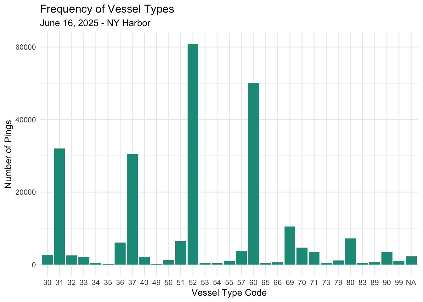
**Frequency of Vessel Types**
Below is a visual of how many pings certain vessel types are sending.
```{r}
ggplot(ais_06_16_2025_trimmed, aes(x = as.factor(vessel_type))) +
  geom_bar(fill = "#1A9988") +
  labs(title = "Frequency of Vessel Types",
       subtitle = "June 16, 2025 - NY Harbor",
       x = "Vessel Type Code",
       y = "Number of Pings") +
  theme_minimal()
```
Most Common Vessel codes:
- 31: Tug and Tow - Towing
- 37: Pleasure craft
- 52: Tug and Tow - Tugging
- 60: All ships of passenger type
**Vessel Size**
```{r}
ggplot(ais_06_16_2025_trimmed, aes(x = length)) +
geom_histogram(binwidth = 10, fill = "#1A9988", color = "white") +
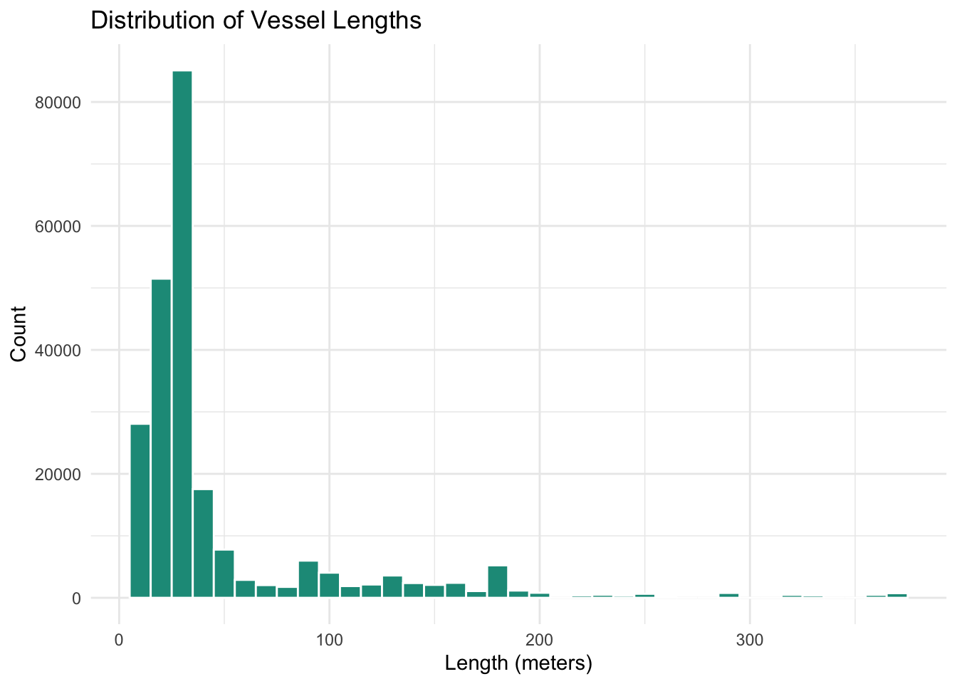
labs(title = "Distribution of Vessel Lengths",
x = "Length (meters)",
y = "Count") +
theme_minimal()
```
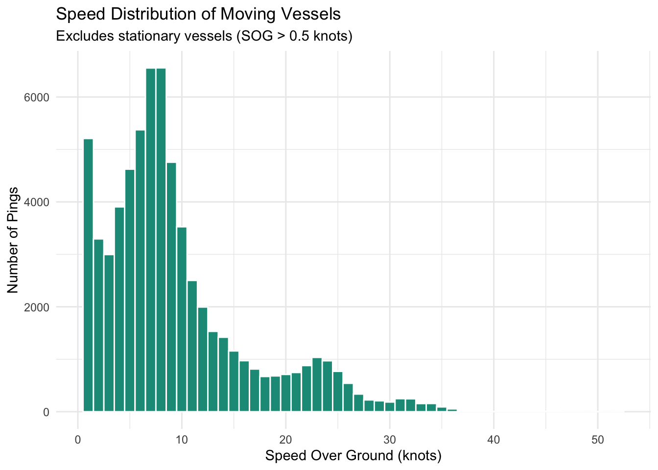
**Traffic Volume**
```{r}
# Note that I ignore docking/docked ships. Noticed a lot of zeros
ais_06_16_2025_trimmed %>%
  filter(sog > 0.5) %>%
  ggplot(aes(x = sog)) +
  geom_histogram(binwidth = 1, fill = "#1A9988", color = "white") +
  labs(title = "Speed Distribution of Moving Vessels",
       subtitle = "Excludes stationary vessels (SOG > 0.5 knots)",
       x = "Speed Over Ground (knots)",
       y = "Number of Pings") +
  theme_minimal()
```
### Hexbin Visualizations
We can aggregate traffic to hexbin cells to understand traffic patterns.
Instead of counting **pings** (raw transmissions) per hexbin, we count **unique vessels**
(distinct MMSIs). This matters because a slow-moving tanker anchored for hours generates
far more pings than a fast tug crossing the harbor — ping count reflects dwell time, not
traffic volume. Vessel count is a more honest measure of how busy a given area of the
harbor actually is.
**Data Loading**
Same June 16–22 subset as before.
```{r load-data-2}
ais <- read.csv("../exploratory_code/ais-eda/AIS_2025_06_16_filtered.csv") %>%
  mutate(
    base_date_time = ymd_hms(base_date_time),
    date = as.Date(base_date_time),
    hour = hour(base_date_time)
  )
```
We created a geojson containing a stable hexbin grid to be used for our project.
```{r build-fishnet}
ais_sf <- ais %>%
  filter(sog > 0.5) %>%
  drop_na(longitude, latitude) %>%
  st_as_sf(coords = c("longitude", "latitude"), crs = 4326) %>%
  st_transform(32118)

fishnet <- st_read("../exploratory_code/hex_grid_100m.geojson") %>%
  st_transform(32118) %>%
  mutate(grid_id = row_number())
```
**Aggregating to Vessel Count**
We filter to moving vessels (SOG > 0.5 knots) to exclude anchored or docked ships.
Count **distinct MMSIs** per cell per hour — not raw pings.
```{r aggregate-vessel-count}
traffic <- fishnet %>%
  st_join(ais_sf) %>%
  filter(!is.na(mmsi)) %>%
  group_by(grid_id, date, hour) %>%
  summarise(
    vessel_count = n_distinct(mmsi),
    ping_count = n(),
    .groups = "drop"
  )
```
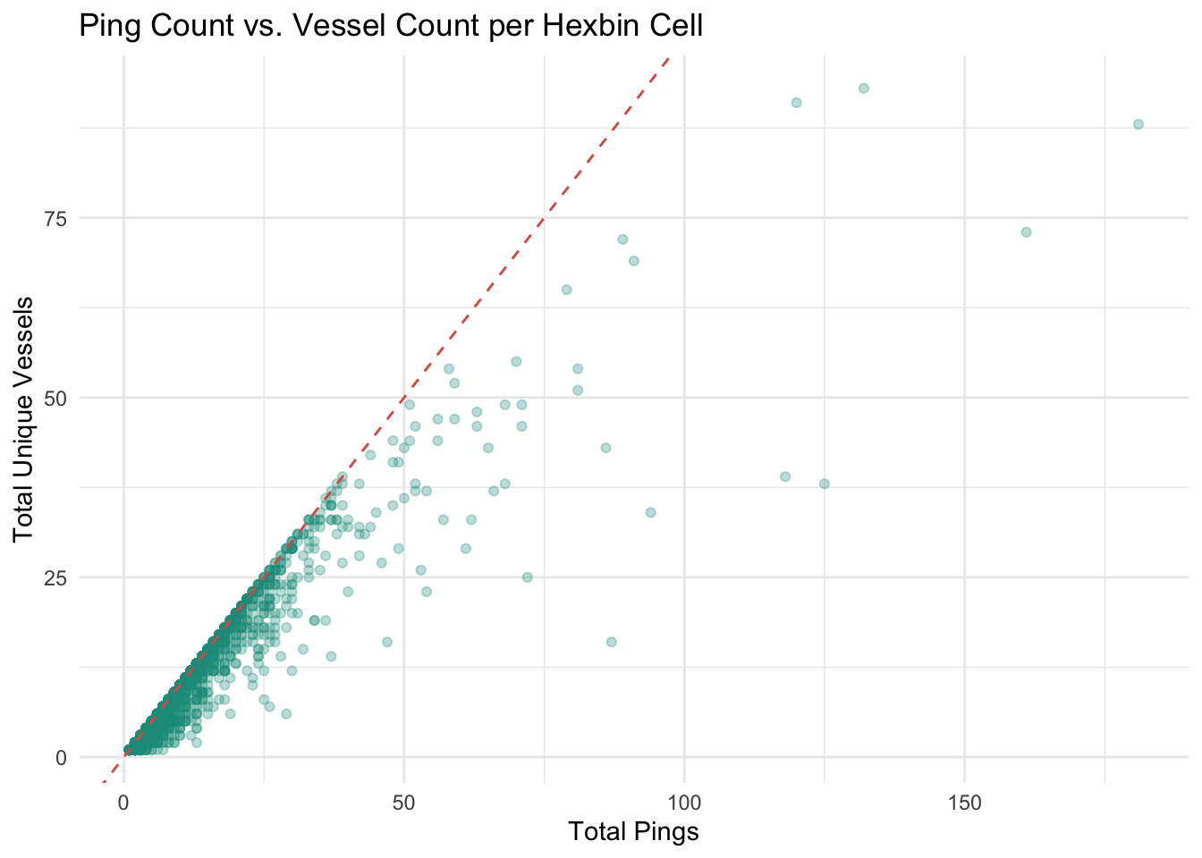
**Ping Count vs. Vessel Count**
This is a quick sanity check to make sure we're on the right path.
Most hexbin cells have more pings than unique vessels, which is exactly what we expect.
Vessels passing through a cell generate multiple pings.
```{r ping-vs-vessel}
traffic %>%
  st_drop_geometry() %>%
  group_by(grid_id) %>%
  summarise(
    total_pings = sum(ping_count),
    total_vessels = sum(vessel_count),
    .groups = "drop"
  ) %>%
  filter(total_pings > 0) %>%
  ggplot(aes(x = total_pings, y = total_vessels)) +
  geom_point(alpha = 0.3, color = "#1A9988") +
  geom_abline(linetype = "dashed", color = "#D95F59") +
  labs(
    title = "Ping Count vs. Vessel Count per Hexbin Cell",
    x = "Total Pings",
    y = "Total Unique Vessels"
  ) +
  theme_minimal()
```
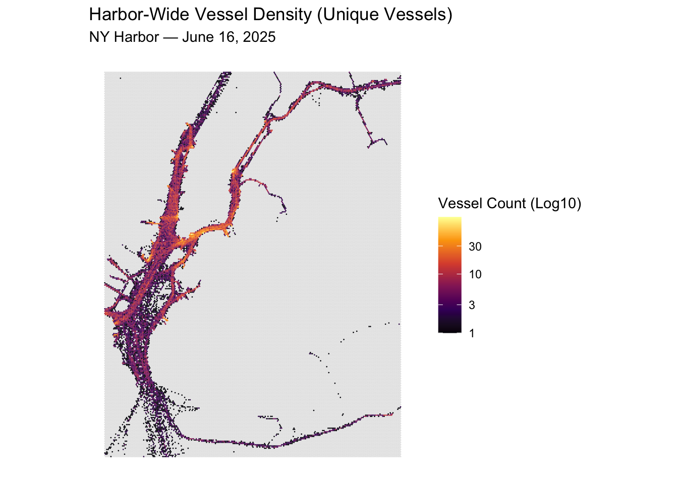
#### Harbor-Wide Vessel Density
Aggregated across the full day to show overall traffic patterns in the harbor.
Note the use of a log scale — vessel counts vary dramatically across cells, and
a log transformation allows us to see variation in both busy and quiet areas.
Log10 is used for better interpretability.
```{r map-harbor-density}
traffic_day <- traffic %>%
  st_drop_geometry() %>%
  group_by(grid_id) %>%
  summarise(vessel_count = sum(vessel_count), .groups = "drop")

fishnet %>%
  left_join(traffic_day, by = "grid_id") %>%
  ggplot() +
  geom_sf(aes(fill = vessel_count), color = NA) +
  scale_fill_viridis_c(option = "inferno", trans = "log10", na.value = "grey90") +
  labs(
    title = "Harbor-Wide Vessel Density (Unique Vessels)",
    subtitle = "NY Harbor — June 16, 2025",
    fill = "Vessel Count (Log10)"
  ) +
  theme_minimal() +
  theme(axis.text = element_blank(), panel.grid = element_blank())
```
Here, we can see some clear patterns that are validated by our domain knowledge. The East River shows a lot of traffic in a tight corridor. Same with the Hudson River, flowing into the area north of the Staten Island.
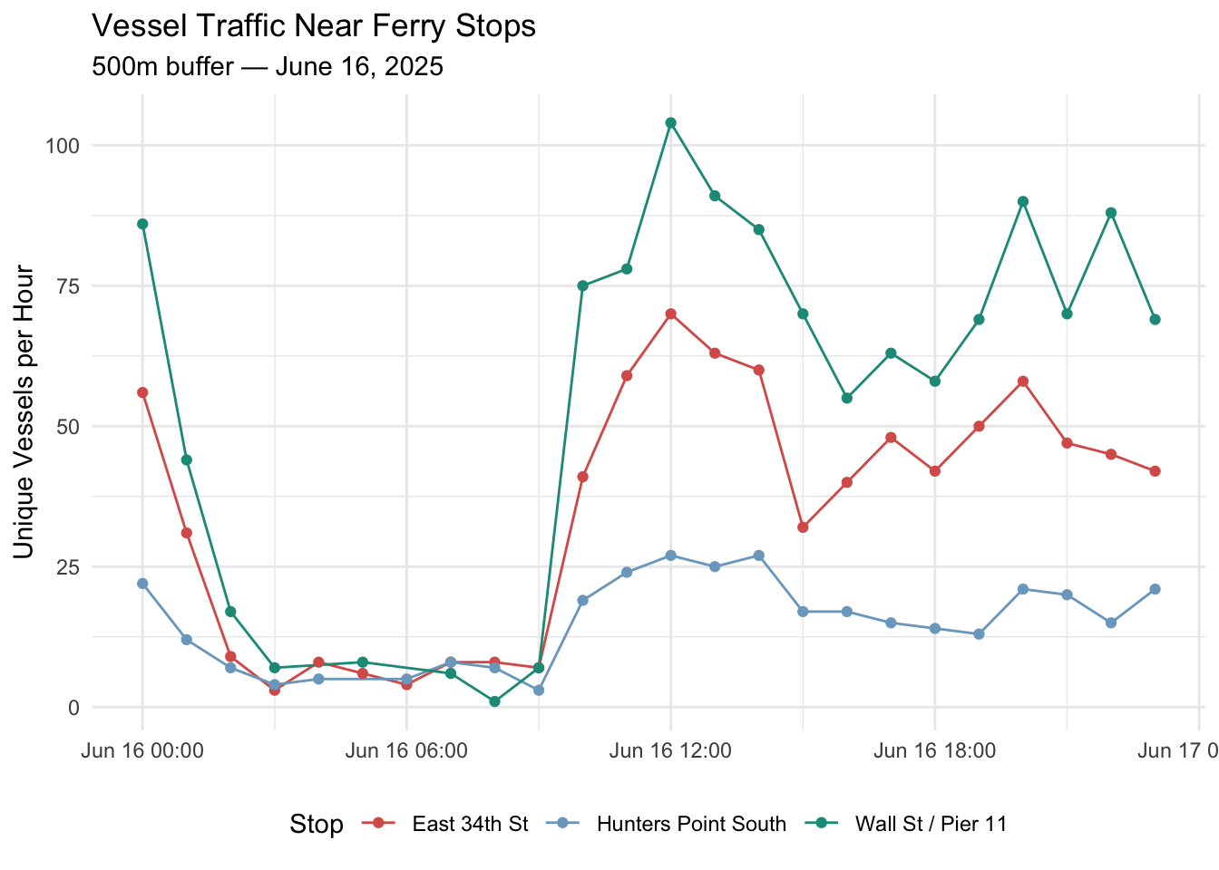
#### Sample Stop-Level Traffic Exploration
Just to explore, I take 3 major ferry stops (hunters point south isn't "major", but just an interesting one):
Question: **how does vessel traffic in the surrounding area vary across the day?**
NOTE: Stops are hard coded here. This is only for exploration purposes.
NOTE 2: We're using 500m buffers to understand patterns further away from stops. The fishnet is still 200m.
```{r stop-traffic-timeseries}
ferry_stops <- tibble(
  stop_name = c("Wall St / Pier 11", "East 34th St", "Hunters Point South"),
  longitude = c(-74.00625, -73.97095, -73.96137),
  latitude  = c(40.70322,  40.74409,  40.74185)
) %>%
  st_as_sf(coords = c("longitude", "latitude"), crs = 4326) %>%
  st_transform(32118)

stop_buffers <- ferry_stops %>%
  mutate(geometry = st_buffer(geometry, dist = 500))

stop_cells <- fishnet %>%
  st_join(stop_buffers) %>%
  filter(!is.na(stop_name)) %>%
  st_drop_geometry() %>%
  select(grid_id, stop_name)

stop_traffic <- traffic %>%
  st_drop_geometry() %>%
  inner_join(stop_cells, by = "grid_id") %>%
  group_by(stop_name, date, hour) %>%
  summarise(vessel_count = sum(vessel_count), .groups = "drop") %>%
  mutate(
    date = as.Date(date),
    datetime = ymd_h(paste(date, hour))
  )

ggplot(stop_traffic, aes(x = datetime, y = vessel_count, color = stop_name)) +
  geom_line() +
  geom_point(size = 1.5) +
  labs(
    title = "Vessel Traffic Near Ferry Stops",
    subtitle = "500m buffer — June 16, 2025",
    x = NULL,
    y = "Unique Vessels per Hour",
    color = "Stop"
  ) +
  scale_color_manual(values = c(
    "Wall St / Pier 11"    = "#1A9988",
    "East 34th St"         = "#D95F59",
    "Hunters Point South"  = "#7BA7C7"
  )) +
  theme_minimal() +
  theme(legend.position = "bottom")
```
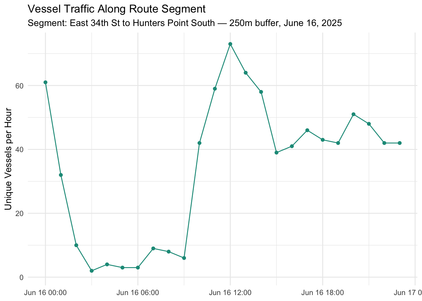
#### In-Water Traffic Along Route Corridors
Beyond stop-level traffic, we want to look at traffic ferries encounter **as they transit between stops**.
This is particularly valuable for understanding in-water delays.
The route geometry below is a straight-line placeholder between East 34th St and
Hunters Point South.
NOTE: **This will be replaced with real SWIFTLY route geometry once that data is wrangled.**
```{r route-traffic}
# Placeholder: straight line East 34th St -> Hunters Point South
# To be replaced with SWIFTLY route geometry
route_placeholder <- st_sfc(
  st_linestring(
    matrix(c(-73.97095, 40.74409,
             -73.96137, 40.74185),
           ncol = 2, byrow = TRUE)
  ),
  crs = 4326
) %>%
  st_transform(32118) %>%
  st_sf() %>%
  mutate(route_id = "east_34th_to_hunters_point")

# Buffer 250m along the route corridor
route_buffer <- route_placeholder %>%
  st_buffer(dist = 250)

# Find fishnet cells intersecting the corridor
route_cells <- fishnet %>%
  st_join(route_buffer) %>%
  filter(!is.na(route_id)) %>%
  st_drop_geometry() %>%
  select(grid_id, route_id)

# Vessel count along corridor by hour
route_traffic <- traffic %>%
  st_drop_geometry() %>%
  inner_join(route_cells, by = "grid_id") %>%
  group_by(route_id, date, hour) %>%
  summarise(vessel_count = sum(vessel_count), .groups = "drop") %>%
  mutate(datetime = ymd_h(paste(date, hour)))

ggplot(route_traffic, aes(x = datetime, y = vessel_count)) +
  geom_line(color = "#1A9988") +
  geom_point(size = 1.5, color = "#1A9988") +
  labs(
    title = "Vessel Traffic Along Route Segment",
    subtitle = "Segment: East 34th St to Hunters Point South — 250m buffer, June 16, 2025",
    x = NULL,
    y = "Unique Vessels per Hour"
  ) +
  theme_minimal()
```
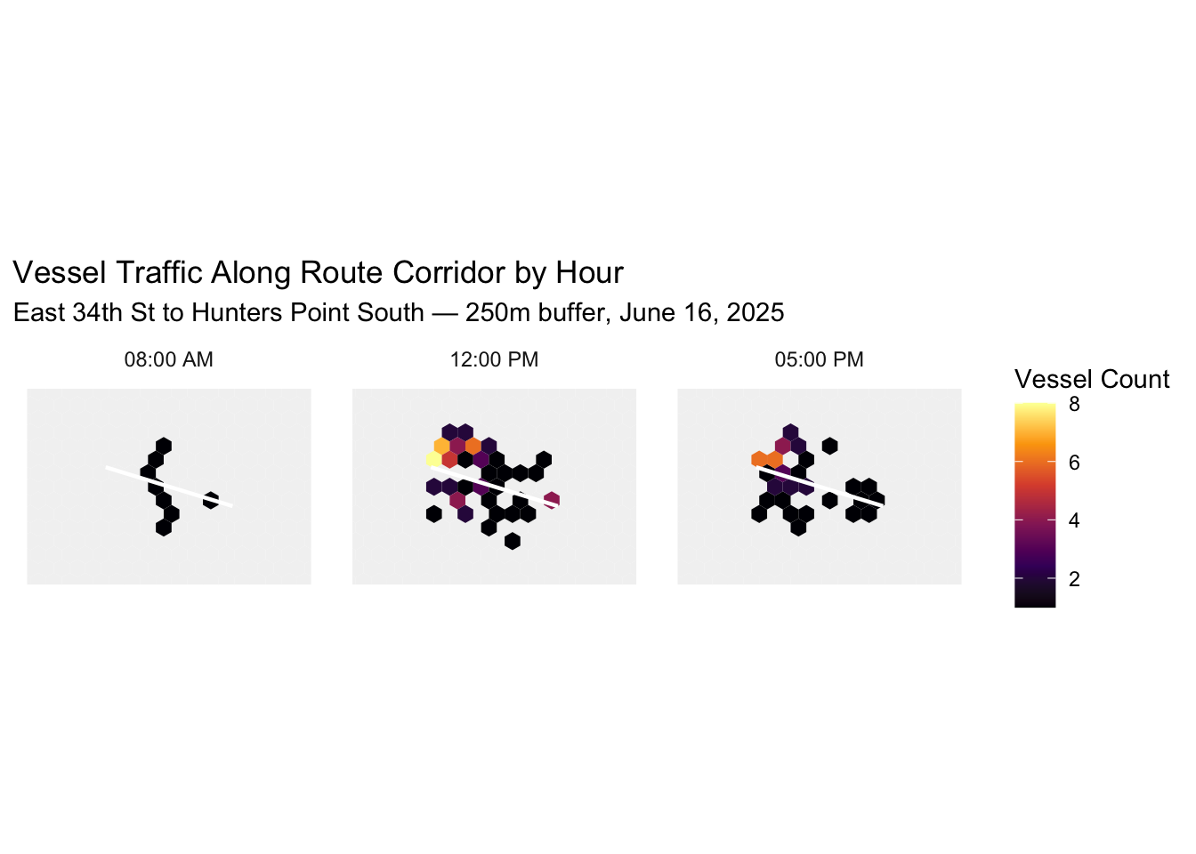
#### Sample Modeling Row
To make the feature concrete, the tables below show what joined observations will
look like in the final modeling dataset. The first table shows the stop-level feature,
the second shows the route corridor feature. In practice these will be joined to the
stop-level delay data by stop, route, date, and hour.
```{r sample-modeling-rows}
stop_traffic %>%
  filter(hour %in% c(8, 12, 17)) %>%
  select(stop_name, date, hour, vessel_count) %>%
  arrange(stop_name, hour) %>%
  knitr::kable(caption = "Sample: AIS Traffic Feature at Stop Level")
route_traffic %>%
  filter(hour %in% c(8, 12, 17)) %>%
  select(route_id, date, hour, vessel_count) %>%
  arrange(hour) %>%
  knitr::kable(caption = "Sample: AIS Traffic Feature Along Route Corridor")
```
```{r route-corridor-maps}
# 500m context buffer
crop_extent <- route_placeholder %>%
  st_buffer(500) %>%
  st_bbox()

corridor_traffic <- traffic %>%
  st_drop_geometry() %>%
  inner_join(route_cells, by = "grid_id") %>%
  filter(hour %in% c(8, 12, 17)) %>%
  group_by(grid_id, hour) %>%
  summarise(vessel_count = sum(vessel_count), .groups = "drop") %>%
  left_join(fishnet, by = "grid_id") %>%
  st_as_sf()

ggplot() +
  geom_sf(data = fishnet %>% st_crop(crop_extent), fill = "grey95", color = NA) +
  geom_sf(data = corridor_traffic, aes(fill = vessel_count), color = NA) +
  geom_sf(data = route_placeholder, color = "white", linewidth = 0.8) +
  scale_fill_viridis_c(option = "inferno", na.value = "grey80") +
  coord_sf(xlim = c(crop_extent["xmin"], crop_extent["xmax"]),
           ylim = c(crop_extent["ymin"], crop_extent["ymax"])) +
  facet_wrap(~hour, nrow = 1, labeller = as_labeller(c(
    "8"  = "08:00 AM",
    "12" = "12:00 PM",
    "17" = "05:00 PM"
  ))) +
  labs(
    title = "Vessel Traffic Along Route Corridor by Hour",
    subtitle = "East 34th St to Hunters Point South — 250m buffer, June 16, 2025",
    fill = "Vessel Count"
  ) +
  theme_minimal() +
  theme(axis.text = element_blank(), panel.grid = element_blank())
```
## Swiftly
**By: Tyler Maynard**
### Background
The Swiftly GPS dataset contains location data every 10-60 seconds from the NYC Ferry AVL system. Columns include vessel, route, trip, block, and coordinates. This will be especially useful in calculating the speed of the vehicle at various points in time, helping identify locations, routes, and trips where the system struggles with on-time performance.
**Reference Week: June 16-22, 2025**
For the sake of processing power, we selected a "sample week" to conduct EDA for Swiftly GPS and AIS data. Based on conversations with NYCEDC, ridership is much higher in the summer months, especially on weekends. Thus, we chose a week during the summer, also including a holiday to evaluate any unique characteristics (if any) during special service days.
```{r swiftly-special-service}
#| warning: false
#| message: false
special_service <- data.frame(
  dates = as.Date(c("2025-06-19")))
```
### Data Import
The Swiftly GPS data set is available by month in CSV files. The following chunk reads the June 2025 CSV file, filters to the dates included in the sample week, and parses out each record's date and time into separate columns.
```{r swiftly-data-import}
#| warning: false
#| message: false
# Original csv
jun2025_original <- read.csv("../exploratory_code/swiftly_eda/swiftly_gps.2025_06.csv")

# Removing extra 'data.' from column names, removing unneeded columns
jun2025 <- jun2025_original %>%
  rename_with(~ gsub("data.", "", .x)) %>%
  select(-(1:3), -(7))

# Converting to datetime
jun2025$time <- ymd_hms(jun2025$time)
jun2025$timeProcessed <- ymd_hms(jun2025$timeProcessed)

# Seeing how many unique values each column has
jun2025 %>%
  summarise(across(everything(), n_distinct)) %>%
  pivot_longer(cols = everything()) %>%
  kable()
# Parse dates and times
jun2025 <- jun2025 %>%
  mutate(
    date_time = ymd_hms(time, tz = "America/New_York"),
    processed_date_time = ymd_hms(timeProcessed, tz = "America/New_York"),

    date = as.Date(date_time),
    time = format(date_time, "%H:%M:%S"),
    hour = substr(time,1,2),

    dateProcessed = as.Date(processed_date_time),
    timeProcessed = format(processed_date_time, "%H:%M:%S"),

    dayOfWeek = if_else(wday(date, week_start = 1) %in% c(6,7), "Weekend", "Weekday"),
    dayOfWeek = case_when(
      date %in% special_service$dates ~ "Holiday",
      TRUE ~ dayOfWeek)) %>%
  select(date, time, dateProcessed, timeProcessed, dayOfWeek, headsign, tripShortName, everything(), date_time, processed_date_time)

jun2025_reference_week <- jun2025 %>%
  filter(date %in% c("2025-06-16","2025-06-17","2025-06-18","2025-06-19","2025-06-20","2025-06-21","2025-06-22")) %>%
  filter(!is.na(tripId)) %>%
  arrange(vehicleId, date_time)
str(jun2025_reference_week$time)
```
### Shapefiles
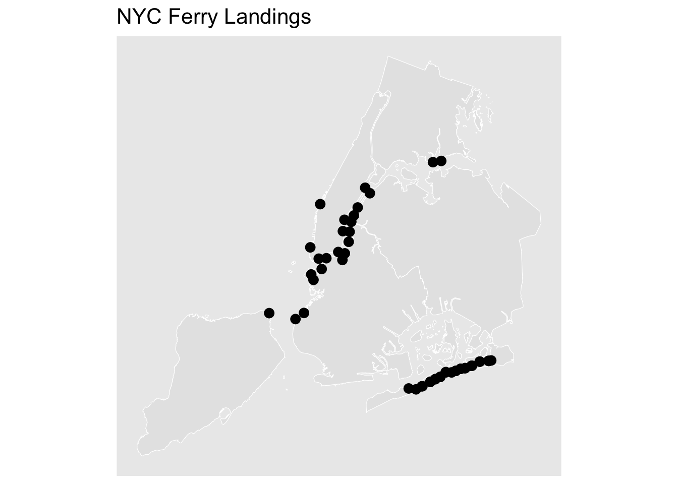
As a way to add more spatial context to this analysis, the landings, routes, hydrology, and boroughs were extracted from the NYC Ferry and NYC OpenData websites. The hydrology object was trimmed to only include hydrology contained within the bounding box created around the study area.
```{r swiftly-sf-objects}
#| warning: false
#| message: false
landings <- read_sf("../exploratory_code/swiftly_eda/Shapefiles/Landings/landings.shp") %>%
  st_transform(32118)

landings_east_river <- landings %>%
  filter(!stop_id %in% c("37","39","43","45","46","48","49","50",
    "51","52","55","56","57","58","61","62",
    "16","88","103","104","105","142",
    "145","149","150","151")) %>%
  st_transform(32118)

routes <- read_sf("../exploratory_code/swiftly_eda/Shapefiles/Routes/routes.shp") %>%
  group_by(route_id) %>%
  summarise() %>%
  st_transform(32118)

boroughs <- read_sf("../exploratory_code/swiftly_eda/Shapefiles/Boroughs/boroughs.shp") %>%
  st_transform(32118)

bbox_east_river <- st_bbox(landings_east_river)
bbox_expanded_east_river <- bbox_east_river
bbox_expanded_east_river["xmin"] <- bbox_east_river["xmin"] - 15000
bbox_expanded_east_river["ymin"] <- bbox_east_river["ymin"] - 15000
bbox_expanded_east_river["xmax"] <- bbox_east_river["xmax"] + 15000
bbox_expanded_east_river["ymax"] <- bbox_east_river["ymax"] + 15000
bbox_poly_east_river <- st_as_sfc(bbox_expanded_east_river)

water <- read_sf("../exploratory_code/swiftly_eda/Shapefiles/Hydrology/WBDHU2.shp") %>%
  st_transform(32118) %>%
  summarise(geometry = st_union(geometry)) %>%
  st_intersection(st_transform(st_as_sfc(st_bbox(bbox_expanded_east_river)), 32118))
```
```{r swiftly-bounding-boxes}
#| warning: false
#| message: false
bbox <- st_bbox(c(
  xmin = -74.30603027343751,
  ymin = 40.492915026895815,
  xmax = -73.64959716796876,
  ymax = 40.919739051062216
), crs = 4326)

bbox_area <- st_as_sfc(bbox) %>%
  st_transform(32118)

bbox_service_area <- boroughs %>%
  st_transform(32118) %>%
  st_bbox()
```
### Data Cleaning
The following chunk creates sf objects for each data point and computes new fields for feature engineering. Features created include:
- **Knots**: based on the time and distance of the previous node of the same trip.
- **Key identifiers**: for different analyses, generally including date, trip, and route.
- **OTP**: classifies on-time performance at each node based on the schedule adherence column (`schedAdhMsec`).
- **Excessively Late**: a binary field indicating whether a record is more than 10 minutes past the expected time.
- **First Record Late**: indicates if the trip starts five minutes past its scheduled time.
- **OTP Transition**: identifies trips where the OTP changes from one status to another (e.g., on-time to late).
Of the 851,238 data points within this sample week, 25,558 were identified as excessively late — approximately three percent of all records.
```{r swiftly-cleaning}
#| warning: false
#| message: false
pts <- st_as_sf(jun2025_reference_week, coords = c("lon", "lat"), crs = 4326, remove = FALSE) %>%
  st_transform(32118)

xy <- st_coordinates(pts)

stopifnot(nrow(jun2025_reference_week) == nrow(xy))

jun2025_reference_week <- jun2025_reference_week %>%
  mutate(x = xy[, 1], y = xy[, 2]) %>%
  group_by(date, blockId, routeId, tripId, directionId, dayOfWeek) %>%
  arrange(date_time, .by_group = TRUE) %>%
  mutate(
    directionId = case_when(
      directionId == 1 ~ "NB",
      TRUE ~ "SB"
    ),
    isFirst = row_number() == 1,
    isSecond = row_number() == 2,
    dist_to_prev_m = round(sqrt((x - lag(x))^2 + (y - lag(y))^2), 2),
    time_diff_sec  = as.numeric(difftime(date_time, lag(date_time), units = "secs")),
    m_per_sec      = if_else(is.na(time_diff_sec) | time_diff_sec <= 0,
                             0,
                             round(dist_to_prev_m / time_diff_sec, 2)),
    knots = m_per_sec * 1.94384,
    date_route_trip_direction_vehicle_dow = paste(date, routeId, tripId, directionId, vehicleId, dayOfWeek, sep = " "),
    key_identifier = paste(date, blockId, routeId, tripId, directionId, dayOfWeek, sep = " "),
    dailyTrip = paste(dayOfWeek, routeId, tripId, sep = " "),
    countDailyTrip = n(),
    OTP = case_when(
      schedAdhMsec < -60000 ~ "Early",
      schedAdhMsec > 600000 ~ "Excessively Late",
      schedAdhMsec > 300000 ~ "Late",
      TRUE ~ "Ontime"
    ),
    excessivelyLate = case_when(
      OTP == "Excessively Late" ~ 1,
      TRUE ~ 0
    ),
    timeOfDay = as.integer(hour(date_time)),
    firstRecordLate = if_else(isSecond == 1 & (OTP == "Late" | OTP == "Excessively Late"), "Yes", "No"),
    OTP_prev = lag(OTP),
    OTP_changed = coalesce(OTP != OTP_prev, FALSE),
    OTP_transition = case_when(
      isFirst ~ "Start",
      is.na(OTP_prev) ~ "Start",
      OTP == OTP_prev ~ "No Change",
      TRUE ~ paste0(OTP_prev, " -> ", OTP)
    )
  ) %>%
  ungroup() %>%
  select(-x, -y, -m_per_sec) %>%
  select(dailyTrip, key_identifier, date_route_trip_direction_vehicle_dow, date, time, dateProcessed, timeProcessed, OTP, OTP_transition, excessivelyLate, timeOfDay, schedAdh, dayOfWeek,
         dist_to_prev_m, time_diff_sec, knots, headsign, tripShortName,
         everything(), date_time, processed_date_time)

summary_table <- data.frame(
  Statistic = names(summary(jun2025_reference_week$knots)),
  Value     = as.numeric(summary(jun2025_reference_week$knots)),
  row.names = NULL
)

jun2025_reference_week_sf <- st_as_sf(jun2025_reference_week, coords = c("lon", "lat"), crs = 4326, remove = FALSE) %>%
  st_transform(32118)

kable(summary_table, digits = 2, caption = "Summary of Knots") %>%
  kable_styling(
    bootstrap_options = c("striped", "hover"),
    full_width = FALSE
  ) %>%
  column_spec(1:2, width = "150px")
jun2025_reference_week %>%
  count(excessivelyLate, sort = TRUE)
jun2025_reference_week_excessively_lates <- jun2025_reference_week %>%
  filter(OTP == "Excessively Late")

jun2025_reference_week_excessively_lates_sf <- st_as_sf(jun2025_reference_week_excessively_lates, coords = c("lon", "lat"), crs = 4326, remove = FALSE) %>%
  st_transform(32118)

hull <- concaveman(jun2025_reference_week_excessively_lates_sf)
bbox_hull <- st_bbox(hull)

ggplot() +
  geom_sf(data = boroughs, color = "white") +
  geom_sf(data = hull, color = "#D95F59", fill = NA, size = 3) +
  coord_sf(
    xlim = c(bbox_east_river["xmin"] - 10000, bbox_east_river["xmax"] + 10000),
    ylim = c(bbox_east_river["ymin"] - 10000, bbox_east_river["ymax"] + 10000),
    expand = FALSE
  ) +
  labs(title = "Excessively Late 'Zone' - Concave Polygon") +
  theme_solid() +
  theme(
    plot.title = element_text(size = 20),
    plot.title.position = "plot"
  )
jun2025_reference_week %>%
  count(routeId)
```
### OTP by Direction
This chunk computes on-time performance by direction (NB or SB), filtering to excessively late records. Northbound and southbound trips comprise roughly the same share of all trips; however, the higher number of excessively late southbound data points could be indicative of other issues.
```{r swiftly-otp-direction}
#| warning: false
#| message: false
jun2025_reference_week_dir <- jun2025_reference_week %>%
  select(dailyTrip, directionId, OTP, routeId) %>%
  filter(OTP == "Excessively Late")

jun2025_reference_week_dir %>%
  count(directionId)
jun2025_reference_week_dir %>%
  count(directionId, routeId)
```
### Bar Charts
The bar charts below visualize key engineered features. The first chart shows the distribution of excessively late trips by the time spent excessively late (as a percentage of total data points per trip).
Three key takeaways from the second plot:
1. Even though weekdays account for the majority of data points, they account for under half of excessively late data points. Weekend service is the only category where excessively late counts surpass non-excessively late counts.
2. Nearly 80 percent of excessively late data points are attributed to the East River and Rockaway routes.
3. The PM peak period (approximately 1pm to 10pm) accounts for the overwhelming majority of problematic data points.
```{r swiftly-bar-charts}
#| warning: false
#| message: false
excessivelyLatePlotVariables <-
  jun2025_reference_week %>%
  as.data.frame() %>%
  select(excessivelyLate, dayOfWeek, routeId, timeOfDay, blockId, directionId, firstRecordLate) %>%
  gather(variable, value, -excessivelyLate) %>%
  filter(!is.na(value))

jun2025_reference_week_wide <- jun2025_reference_week %>%
  count(key_identifier, OTP) %>%
  pivot_wider(
    names_from = OTP,
    values_from = n,
    values_fill = 0
  ) %>%
  mutate(Total = rowSums(across(-key_identifier)))

jun2025_reference_week_wide
jun2025_reference_week_percents <- jun2025_reference_week_wide %>%
  mutate(round(across(-c(key_identifier, Total), ~ . / Total * 100), 2)) %>%
  pivot_longer(
    cols = -c(key_identifier, Total),
    names_to = "OTP",
    values_to = "Percent"
  ) %>%
  filter(OTP == "Excessively Late", Percent > 0) %>%
  mutate(Percent_Rounded = round(Percent, 0))

mean_val <- mean(jun2025_reference_week_percents$Percent_Rounded)
median_val <- median(jun2025_reference_week_percents$Percent_Rounded)

ggplot() +
  geom_histogram(data = jun2025_reference_week_percents, color = "white", fill = "#1A9988", linewidth = 0.3, aes(x = Percent_Rounded), binwidth = 10) +
  geom_vline(xintercept = mean_val, color = "#D95F59", linetype = "dashed", linewidth = 1) +
  geom_vline(xintercept = median_val, color = "#F2C14E", linetype = "dashed", linewidth = 1) +
  annotate("text", x = mean_val, y = 15, label = "Mean", color = "#D95F59", angle = 90, vjust = -0.5) +
  annotate("text", x = median_val, y = 15, label = "Median", color = "#F2C14E", angle = 90, vjust = -0.5) +
  labs(
    title = "Distribution of Excessively Late Trips by Time Spent Excessively Late",
    x = "Percent",
    y = "Count"
  ) +
  theme_excel_new() +
  theme(
    axis.title = element_text(size = 14),
    plot.title = element_text(size = 20),
    plot.subtitle = element_text(size = 16),
    plot.title.position = "plot"
  )
plot_df <- excessivelyLatePlotVariables %>%
  group_by(excessivelyLate, variable, value) %>%
  summarise(count = n(), .groups = "drop") %>%
  group_by(excessivelyLate, variable) %>%
  mutate(prop = count / sum(count)) %>%
  ungroup()

ggplot(plot_df, aes(x = ifelse(variable == "timeOfDay", as.numeric(value), value),
                    y = prop, fill = as.factor(excessivelyLate))) +
  geom_col(position = "dodge") +
  facet_wrap(~ variable, scales = "free_x") +
  scale_y_continuous(labels = scales::percent) +
  scale_fill_manual(values = c("0" = "#1A9988", "1" = "#D95F59"),
                    labels = c("Not Excessively Late", "Excessively Late"),
                    name = "") +
  labs(x = NULL, y = "Percent within group") +
  theme_excel_new()
```
```{r swiftly-bar-chart-by-route}
#| warning: false
#| message: false
jun2025_reference_week <- jun2025_reference_week %>%
  mutate(day_route = paste(dayOfWeek, routeId, sep = " "))

speed_by_route <- jun2025_reference_week %>%
  group_by(day_route, dayOfWeek, routeId) %>%
  summarise(
    avgKnots = mean(knots, na.rm = TRUE),
    medKnots = median(knots, na.rm = TRUE),
    n = dplyr::n(),
    .groups = "drop"
  )

ggplot() +
  geom_col(data = speed_by_route, aes(x = day_route, y = avgKnots, fill = dayOfWeek)) +
  labs(
    title = "Average Speed by Route and Service Level",
    x = "Service Level",
    y = "Average Knots"
  ) +
  scale_fill_manual(
    values = c(
      "Holiday" = "#F2C14E",
      "Weekday" = "#1A9988",
      "Weekend" = "#D95F59"
    )
  ) +
  theme_excel_new() +
  theme(
    plot.title = element_text(size = 20),
    plot.subtitle = element_text(size = 16),
    plot.title.position = "plot",
    axis.text.x = element_text(angle = 45, hjust = 1)
  )
```
### Landings Map
```{r swiftly-landings-map}
#| warning: false
#| message: false
ggplot() +
  geom_sf(data = boroughs, color = "white") +
  geom_sf(data = landings, color = "black", size = 3) +
  labs(title = "NYC Ferry Landings") +
  theme_solid() +
  theme(
    plot.title = element_text(size = 16),
    plot.title.position = "plot"
  )
```
### Fishnet and Kernel Density
Since these datasets contain thousands of points per day, aggregation is the most efficient way to process and observe the data. A fishnet was created using a grid cell side of 250 meters. The figure represents the data for the sample week, excluding any grid cell with a density of 0.
```{r swiftly-fishnet}
#| dev: "ragg_png"
#| dpi: 300
#| warning: false
#| message: false
fishnet_swiftly <-
  st_make_grid(water, cellsize = 250) %>%
  st_sf() %>%
  mutate(uniqueID = rownames(.))

jun2025_net <- st_join(
  fishnet_swiftly, jun2025_reference_week_excessively_lates_sf, join = st_intersects) %>%
  group_by(uniqueID) %>%
  summarise(mean_speed = mean(knots, na.rm = TRUE),
            n = n(), .groups = "drop") %>%
  filter(!is.na(mean_speed))

jun2025_ppp <- as.ppp(st_coordinates(jun2025_reference_week_excessively_lates_sf), W = st_bbox(jun2025_net))
jun2025_KD <- density.ppp(jun2025_ppp, sigma = 1000)

as.data.frame(jun2025_KD) %>%
  st_as_sf(coords = c("x", "y"), crs = st_crs(jun2025_net)) %>%
  aggregate(., jun2025_net, mean) %>%
  ggplot() +
    geom_sf(aes(fill = value), color = NA, linewidth = 0) +
    geom_sf(data = landings, color = "black", size = 1, alpha = 0.5) +
    scale_fill_viridis(name = "Density") +
    labs(title = "Kernel Density of Excessively Late Data Points, 6/16/25 to 6/22/25") +
    theme_solid() +
    theme(
      plot.title = element_text(size = 16),
      plot.title.position = "plot"
    )
```
### Mean Speed
The following figure shows the average speed of each data point in knots per grid cell, regardless of on-time performance designation.
```{r swiftly-mean-speed}
#| warning: false
#| message: false
ggplot(jun2025_net) +
  geom_sf(data = boroughs, color = "white") +
  geom_sf(data = landings, color = "black", size = 2, alpha = 0.5) +
  geom_sf(aes(fill = mean_speed), color = NA) +
  coord_sf(
    xlim = c(bbox_hull["xmin"] - 100, bbox_hull["xmax"] + 100),
    ylim = c(bbox_hull["ymin"] - 200, bbox_hull["ymax"] + 200),
    expand = FALSE
  ) +
  scale_fill_viridis_c(option = "D", name = "Knots") +
  labs(title = "Mean Vessel Speed by Cell") +
  theme_solid() +
  theme(
    plot.title = element_text(size = 16),
    plot.title.position = "plot"
  )
```
### Kernel Density Plots — Hourly
To analyze how OTP changes spatially throughout the PM peak, kernel densities of excessively late data points were mapped for each hour between 1pm and 10pm.
```{r swiftly-kds}
#| dev: "ragg_png"
#| dpi: 300
#| warning: false
#| message: false
make_hourly_kd <- function(hour_val) {
  net <- st_join(fishnet_swiftly, jun2025_reference_week_excessively_lates_sf, join = st_intersects) %>%
    group_by(uniqueID) %>%
    filter(hour == hour_val) %>%
    summarise(mean_speed = mean(knots, na.rm = TRUE), n = n(), .groups = "drop")
  kd <- density.ppp(as.ppp(st_coordinates(net), W = st_bbox(jun2025_net)), sigma = 1000)
  kd
}

kd_list <- list(
  '1PM'  = make_hourly_kd("13"),
  '2PM'  = make_hourly_kd("14"),
  '3PM'  = make_hourly_kd("15"),
  '4PM'  = make_hourly_kd("16"),
  '5PM'  = make_hourly_kd("17"),
  '6PM'  = make_hourly_kd("18"),
  '7PM'  = make_hourly_kd("19"),
  '8PM'  = make_hourly_kd("20"),
  '9PM'  = make_hourly_kd("21"),
  '10PM' = make_hourly_kd("22")
)

all_values <- unlist(lapply(kd_list, \(kd) as.data.frame(kd)$value))
global_limits <- range(all_values, na.rm = TRUE)

plots <- imap(kd_list, ~{
  sf_pts <- st_as_sf(as.data.frame(.x), coords = c("x", "y"), crs = st_crs(jun2025_net))
  agg <- aggregate(sf_pts["value"], jun2025_net, mean, na.rm = TRUE)

  ggplot() +
    geom_sf(data = boroughs, color = "white") +
    geom_sf(data = agg, aes(fill = value), color = NA, linewidth = 0) +
    coord_sf(
      xlim = c(bbox_hull["xmin"] - 100, bbox_hull["xmax"] + 100),
      ylim = c(bbox_hull["ymin"] - 100, bbox_hull["ymax"] + 100),
      expand = FALSE
    ) +
    scale_fill_viridis_c(name = "Kernel Density", limits = global_limits, oob = scales::squish) +
    labs(title = paste("KD -", .y)) +
    theme_solid() +
    theme(
      plot.title = element_text(size = 12),
      plot.title.position = "plot"
    )
})

wrap_plots(plots, ncol = 5) +
  plot_layout(guides = "collect") +
  plot_annotation(
    title = "Excessively Late Across TOD",
    caption = "Unified KD Scale, 250m Grid Cell Size"
  ) &
  theme(
    legend.position = "right",
    legend.box = "horizontal",
    plot.margin = margin(1, 1, 1, 1)
  )
```
One potentially useful consideration is to observe locations where trips change OTP status. The following figure includes only instances where OTP status changes to either late or excessively late.
```{r swiftly-otp-transitions}
#| warning: false
#| message: false
jun2025_reference_week_late_sf <- jun2025_reference_week_sf %>%
  filter(OTP_transition %in% c("Early -> Late", "Late -> Excessively Late",
                                "Ontime -> Late", "Ontime -> Excessively Late"))

ggplot() +
  geom_sf(data = boroughs, color = "white") +
  geom_sf(data = landings, color = "black", size = 2, alpha = 0.2) +
  geom_sf(data = jun2025_reference_week_late_sf,
          aes(color = OTP_transition), size = 2, alpha = 0.2) +
  coord_sf(
    xlim = c(bbox_east_river["xmin"] - 10000, bbox_east_river["xmax"] + 10000),
    ylim = c(bbox_east_river["ymin"] - 10000, bbox_east_river["ymax"] + 10000),
    expand = FALSE
  ) +
  labs(title = "OTP Transition Locations") +
  scale_color_manual(
    name = "Transition Type",
    values = c(
      "Early -> Late"               = "#7BA7C7",
      "Ontime -> Late"              = "#1A9988",
      "Ontime -> Excessively Late"  = "#F2C14E",
      "Late -> Excessively Late"    = "#D95F59"
    ),
    labels = c(
      "Early -> Late"               = "Early to Late",
      "Ontime -> Late"              = "Ontime to Late",
      "Ontime -> Excessively Late"  = "Ontime to Excessively Late",
      "Late -> Excessively Late"    = "Late to Excessively Late"
    )
  ) +
  facet_wrap(~OTP_transition) +
  theme_solid() +
  theme(
    plot.title = element_text(size = 20),
    plot.title.position = "plot"
  )
```
### Leaflet Distribution
```{r swiftly-leaflet}
#| warning: false
#| message: false
#| eval: false
landings_buffers_100ft <- st_buffer(landings, dist = 30.48)
counts <- lengths(st_intersects(landings_buffers_100ft, jun2025_reference_week_excessively_lates_sf))
landings_buffers_100ft$record_count <- counts

points_plot  <- st_transform(landings, 4326)
buffers_plot <- st_transform(landings_buffers_100ft, 4326)
routes_plot  <- st_transform(routes, 4326)
boroughs_plot <- st_transform(boroughs, 4326)

jun2025_reference_week_elate_sf <- jun2025_reference_week_sf %>%
  filter(OTP == "Excessively Late") %>%
  st_transform(4326)

jun2025_reference_week_not_elate_sf <- jun2025_reference_week_sf %>%
  filter(OTP != "Excessively Late") %>%
  st_transform(4326)

leaflet() %>%
  addProviderTiles("Esri.WorldImagery", group = "Imagery",
                   options = tileOptions(opacity = 0.6)) %>%
  addPolygons(data = boroughs_plot, color = "#828282", weight = 1, fillOpacity = 0.75, group = "Boroughs") %>%
  addPolylines(data = routes_plot, color = "#1A9988", weight = 2, opacity = 0.2, group = "Routes") %>%
  addPolygons(data = buffers_plot, color = "#F2C14E", weight = 10, fillOpacity = 0.75, group = "Landings",
              label = ~paste0("Records: ", record_count)) %>%
  addCircleMarkers(data = points_plot, radius = 3, color = "#F2C14E", opacity = 0.6, group = "Landings") %>%
  addCircleMarkers(data = jun2025_reference_week_elate_sf, radius = 0.5, color = "#D95F59",
    opacity = 0.6, fillOpacity = 0.4, group = "Excessively Late",
    label = ~paste0("Speed: ", round(knots, 2)),
    popup = ~paste0("<b>Speed:</b> ", round(knots, 2), " knots",
                    "<br><b>Route:</b> ", routeId,
                    "<br><b>Trip:</b> ", tripId,
                    "<br><b>Vessel:</b> ", vehicleId,
                    "<br><b>Time:</b> ", time)) %>%
  addCircleMarkers(data = jun2025_reference_week_not_elate_sf, radius = 0.5, color = "#7BA7C7",
    opacity = 0.6, fillOpacity = 0.4, group = "Not Excessively Late",
    label = ~paste0("Speed: ", round(knots, 2)),
    popup = ~paste0("<b>Speed:</b> ", round(knots, 2), " knots",
                    "<br><b>Route:</b> ", routeId,
                    "<br><b>Trip:</b> ", tripId,
                    "<br><b>Vessel:</b> ", vehicleId,
                    "<br><b>Time:</b> ", time)) %>%
  addLayersControl(
    overlayGroups = c("Boroughs", "Routes", "Landings", "Excessively Late", "Not Excessively Late"),
    baseGroups = c("Imagery"),
    options = layersControlOptions(collapsed = FALSE)
  )
```
This Leaflet map shows the data with an imagery layer for context. For the sake of processing power, the results are not shown by default — remove the `eval: false` chunk option to render it.
# Modeling
## Associative Model
**By: Yiming 'Ming' Cao**
### Objective and Design
This section presents an associative model for explaining stop-level arrival lateness in the NYC Ferry system. The goal is interpretation rather than advance prediction. Instead of asking only whether a future trip will be delayed, this model asks which historical factors are associated with observed delay patterns.
The unit of analysis is a stop-level observation. The dependent variable is arrival lateness in minutes relative to the original schedule. Predictors are organized into five explanatory domains: structural context, environmental conditions, temporal patterns, operational propagation, and vessel characteristics.
This grouped design allows us to compare how different types of factors contribute to delay variation while keeping the final model interpretable for operational use.
```{r ming-settings}
#| message: false
#| warning: false
set.seed(7900)

input_parquet <- "../exploratory_code/modeling/associative/baseline_modeling_table_final_direct.parquet"
outcome_cont  <- "lateness_vs_original_schedule_min"

week_window_days <- 3

candidate_predictors <- c(
  "route_id", "direction", "stop_sequence", "prev_stop_sched_hour", "prev_stop_sched_hour_group",
  "schedule_season", "schedule_daytype", "vessel_trip_seq_in_chain", "vessel_capacity",
  "is_terminal_stop", "prev_stop_shared_stop_flag", "curr_stop_shared_stop_flag",
  "planned_turnaround_gap_min", "scheduled_headway_min", "expected_water_min",
  "prev_stop_sequence", "prev_stop_boardings", "prev_stop_alightings", "prev_stop_onboard",
  "prev_stop_load_factor", "env_temperature_c", "env_wind_speed_mps", "env_visibility_m",
  "env_precipitation_mm", "env_battery_water_level_anomaly", "env_narrows_current_residual",
  "env_battery_water_level_obs", "env_narrows_current_obs"
)
prior_delay_predictors <- c("inherited_prev_trip_delay", "carried_within_trip_delay")
```
### Data Scope
The model uses the stop-level baseline modeling table as its input dataset. After loading the data, we confirmed the number of records and the availability of candidate predictors before fitting the associative models.
```{r ming-load}
#| message: false
#| warning: false
if (!file.exists(input_parquet)) stop("Missing input parquet: ", input_parquet)
df_raw <- read_parquet(input_parquet) %>% as_tibble()

df <- df_raw %>%
  mutate(
    trip_date = as.Date(substr(as.character(trip_key), 1, 8), format = "%Y%m%d")
  )

predictors_no_prior   <- intersect(candidate_predictors, names(df))
predictors_with_prior <- unique(c(predictors_no_prior, intersect(prior_delay_predictors, names(df))))

tibble(
  input_rows              = nrow(df_raw),
  rows_after_load         = nrow(df),
  predictors_no_prior_n   = length(predictors_no_prior),
  predictors_with_prior_n = length(predictors_with_prior)
) %>% kable(caption = "Data Scope and Predictor Availability")
```
### Predictor Domains
To support interpretation, predictors in the associative model were organized into five explanatory domains. This grouped structure separates baseline route and stop context from environmental conditions, temporal patterns, operational propagation, and vessel-related characteristics. The goal is to interpret delay association at the domain level rather than focusing only on isolated individual coefficients.
#### Domain A: Structural Context
The structural domain captures baseline differences in how delay varies across the ferry network. These predictors describe route, stop position, and stop-context features that reflect how service is organized spatially and operationally. Variables in this domain include route and direction identifiers, stop sequence, terminal status, and shared-stop context. We interpret this domain as representing the structural baseline of delay rather than short-term changing conditions.
#### Domain B: Environmental Conditions
The environmental domain captures external natural conditions that may affect vessel movement and docking performance. These predictors include weather and water-related variables such as temperature, wind speed, visibility, precipitation, water-level, and current-related measures. This domain is especially important for the client because it helps distinguish external operating conditions from delay that is simply inherited from earlier parts of the trip.
#### Domain C: Temporal Patterns
The temporal domain captures recurring calendar and time-of-day structure in delay. These predictors describe when service occurs rather than where it occurs or what the vessel has already experienced. Variables in this domain include scheduled hour, scheduled hour group, day type, and season. We use this domain to represent regular service rhythms such as weekday versus weekend patterns, seasonal demand differences, and time-of-day effects.
#### Domain D: Operational Propagation
The operational propagation domain captures delay carried forward through the operating chain. These predictors reflect whether lateness has already accumulated earlier in the trip or in a prior linked trip on the same vessel. Variables in this domain include inherited previous-trip delay and carried within-trip delay. This domain is operationally meaningful, but it is interpreted as one component of the associative model rather than the sole basis for explaining delay.
#### Domain E: Vessel Characteristics
The vessel domain captures systematic differences associated with vessel capacity and operating role. These predictors help assess whether some delay patterns are associated with the characteristics of the vessel being used rather than only with route structure or environmental conditions. Variables in this domain include vessel capacity and related vessel-level operational identifiers retained in the final specification.
### Data Preparation
Before model estimation, the stop-level modeling table was prepared to support a consistent and interpretable associative model. This section summarizes the key preparation steps: variable construction, missing-value treatment for environmental fields, and helper functions used for model fitting and summary extraction.
#### Data Cleaning and Variable Construction
The input table was converted into a stop-level analytic dataset. We created a trip date field from the trip identifier, checked which candidate predictors were available, and retained variables needed for the outcome and domain-based model structure.
#### Environmental Variable Imputation
Missing environmental values were imputed using a local time-slot rolling rule. The primary fill used observations from the same scheduled hour within a centered seven-day window around the trip date. If no value was available, the method fell back to the same scheduled hour group within the same centered window.
This approach keeps environmental predictors in the model without relying only on complete-case filtering. It also keeps the imputed values tied to nearby dates and comparable operating periods.
```{r ming-impute}
#| message: false
#| warning: false
build_week_fill_map <- function(day_slot_tbl, group_col, date_col = "trip_date", value_col = "slot_day_median", window_days = 3) {
  if (nrow(day_slot_tbl) == 0) return(tibble())
  split_tbl <- split(day_slot_tbl, day_slot_tbl[[group_col]], drop = TRUE)
  out <- lapply(split_tbl, function(gdf) {
    gdf <- gdf[order(gdf[[date_col]]), , drop = FALSE]
    d <- gdf[[date_col]]
    v <- gdf[[value_col]]
    week_fill <- vapply(seq_along(v), function(i) {
      idx <- abs(as.integer(d - d[i])) <= window_days
      val <- suppressWarnings(median(v[idx], na.rm = TRUE))
      ifelse(is.finite(val), val, NA_real_)
    }, numeric(1))
    gdf$week_fill <- week_fill
    gdf[, c(group_col, date_col, "week_fill"), drop = FALSE]
  })
  bind_rows(out)
}

impute_by_local_slot_week <- function(data, var_name, window_days = 3) {
  x <- data
  miss_before <- sum(is.na(x[[var_name]]))
  if (miss_before == 0) {
    return(list(data = x, summary = tibble(variable = var_name, n_missing_before = 0L, n_filled_primary = 0L, n_filled_fallback = 0L, n_missing_after = 0L)))
  }

  primary_daily <- x %>%
    filter(!is.na(.data[[var_name]]), !is.na(trip_date), !is.na(prev_stop_sched_hour)) %>%
    group_by(prev_stop_sched_hour, trip_date) %>%
    summarise(slot_day_median = median(.data[[var_name]], na.rm = TRUE), .groups = "drop")
  primary_fill <- build_week_fill_map(primary_daily, group_col = "prev_stop_sched_hour", value_col = "slot_day_median", window_days = window_days) %>%
    rename(fill_primary = week_fill)

  fallback_daily <- x %>%
    filter(!is.na(.data[[var_name]]), !is.na(trip_date), !is.na(prev_stop_sched_hour_group)) %>%
    group_by(prev_stop_sched_hour_group, trip_date) %>%
    summarise(slot_day_median = median(.data[[var_name]], na.rm = TRUE), .groups = "drop")
  fallback_fill <- build_week_fill_map(fallback_daily, group_col = "prev_stop_sched_hour_group", value_col = "slot_day_median", window_days = window_days) %>%
    rename(fill_fallback = week_fill)

  x <- x %>%
    left_join(primary_fill, by = c("prev_stop_sched_hour", "trip_date")) %>%
    left_join(fallback_fill, by = c("prev_stop_sched_hour_group", "trip_date"))

  was_missing      <- is.na(x[[var_name]])
  fill_primary_idx  <- was_missing & !is.na(x$fill_primary)
  fill_fallback_idx <- was_missing & is.na(x$fill_primary) & !is.na(x$fill_fallback)

  x[[var_name]][fill_primary_idx]  <- x$fill_primary[fill_primary_idx]
  x[[var_name]][fill_fallback_idx] <- x$fill_fallback[fill_fallback_idx]
  x <- x %>% select(-fill_primary, -fill_fallback)

  list(
    data = x,
    summary = tibble(
      variable          = var_name,
      n_missing_before  = miss_before,
      n_filled_primary  = sum(fill_primary_idx, na.rm = TRUE),
      n_filled_fallback = sum(fill_fallback_idx, na.rm = TRUE),
      n_missing_after   = sum(is.na(x[[var_name]]))
    )
  )
}

impute_vars <- intersect(
  c("env_temperature_c", "env_wind_speed_mps", "env_visibility_m",
    "env_precipitation_mm", "env_narrows_current_residual",
    "env_battery_water_level_obs", "env_narrows_current_obs"),
  names(df)
)

impute_summary_list <- list()
df_imp <- df
for (v in impute_vars) {
  res <- impute_by_local_slot_week(df_imp, v, window_days = week_window_days)
  df_imp <- res$data
  impute_summary_list[[length(impute_summary_list) + 1]] <- res$summary
}
imputation_summary <- bind_rows(impute_summary_list)
```
```{r ming-imputation-summary}
imputation_summary %>%
  mutate(
    pct_missing_before = round(n_missing_before / nrow(df) * 100, 2),
    pct_missing_after  = round(n_missing_after  / nrow(df_imp) * 100, 2)
  ) %>%
  kable(caption = "Summary of Environmental Variable Imputation", digits = 2)
```
#### Modeling Utilities
A small set of reusable helper functions was created to prepare model inputs, fit linear models, extract model metrics, and generate standardized coefficient summaries.
```{r ming-helpers}
#| message: false
#| warning: false
prepare_model_df <- function(data, outcome, predictors) {
  data %>% select(all_of(c(outcome, predictors))) %>% drop_na()
}

fit_linear <- function(data, model_name, outcome, predictors) {
  d   <- prepare_model_df(data, outcome, predictors)
  fml <- as.formula(paste(outcome, "~", paste(predictors, collapse = " + ")))
  fit <- lm(fml, data = d)
  pred <- predict(fit, newdata = d)
  rmse <- sqrt(mean((d[[outcome]] - pred)^2))
  g    <- glance(fit)

  list(
    metrics = tibble(
      model_name  = model_name, model_type = "linear",
      n = nrow(d), aic = g$AIC, bic = g$BIC,
      rsq = g$r.squared, adj_rsq = g$adj.r.squared, rmse = rmse,
      pseudo_rsq = NA_real_, accuracy = NA_real_,
      sensitivity = NA_real_, specificity = NA_real_, auc = NA_real_
    ),
    coefs        = tidy(fit) %>% mutate(model_name = model_name, model_type = "linear"),
    formula_text = paste(deparse(fml), collapse = "")
  )
}

standardize_for_lm <- function(data, outcome, predictors) {
  d       <- data %>% select(all_of(c(outcome, predictors))) %>% drop_na()
  num_vars <- names(d)[sapply(d, is.numeric)]
  d %>% mutate(across(all_of(num_vars), ~ as.numeric(scale(.x))))
}

fit_standardized_linear <- function(data, model_name, outcome, predictors) {
  d_std <- standardize_for_lm(data, outcome, predictors)
  fml   <- as.formula(paste(outcome, "~", paste(predictors, collapse = " + ")))
  fit   <- lm(fml, data = d_std)
  broom::tidy(fit) %>%
    filter(term != "(Intercept)") %>%
    mutate(model_name = model_name, abs_estimate = abs(estimate)) %>%
    arrange(desc(abs_estimate))
}
```
### Variable Screening and Final Specification
This section explains how the final associative-model specification was selected from the broader predictor pool. The goal was not to include every available variable, but to keep interpretable coverage across the five explanatory domains while reducing redundancy among closely related predictors.
#### Initial Candidate Variables
The initial predictor pool was intentionally broad so that each explanatory domain was represented. Candidate variables included route and stop structure, environmental conditions, temporal indicators, operational propagation terms, and vessel/load-related characteristics. This broader pool provided the starting point for a smaller, more interpretable final specification.
```{r ming-domain-predictors}
#| message: false
#| warning: false
domain_a_predictors <- intersect(c(
  "route_id", "direction", "stop_sequence", "is_terminal_stop",
  "prev_stop_shared_stop_flag", "curr_stop_shared_stop_flag"
), names(df_imp))

domain_b_predictors <- intersect(c(
  "env_temperature_c", "env_wind_speed_mps", "env_visibility_m",
  "env_precipitation_mm", "env_narrows_current_residual",
  "env_battery_water_level_obs", "env_narrows_current_obs"
), names(df_imp))

domain_c_predictors <- intersect(c(
  "prev_stop_sched_hour", "schedule_season", "schedule_daytype"
), names(df_imp))

domain_d_predictors <- intersect(c(
  "inherited_prev_trip_delay", "carried_within_trip_delay"
), names(df_imp))

domain_e_predictors <- intersect(c(
  "vessel_capacity", "vessel_trip_seq_in_chain",
  "prev_stop_boardings", "prev_stop_alightings",
  "prev_stop_onboard", "prev_stop_load_factor"
), names(df_imp))

final_predictors <- unique(c(
  domain_a_predictors, domain_b_predictors,
  domain_c_predictors, domain_d_predictors, domain_e_predictors
))
```
#### Redundancy and Multicollinearity Checks
Because several candidate predictors measured closely related aspects of stop position, ridership, and operating context, we reviewed pairwise correlations among numeric predictors before fitting the final associative model. The goal was not to eliminate all correlation, but to identify clusters of variables that conveyed largely overlapping information and would make coefficient interpretation less clear.
```{r ming-corr-setup}
#| message: false
#| warning: false
numeric_candidate_predictors <- intersect(
  candidate_predictors,
  names(df_imp)[sapply(df_imp, is.numeric)]
)

corr_vars   <- df_imp %>%
  select(all_of(numeric_candidate_predictors)) %>%
  select(where(~ !all(is.na(.))))

corr_matrix <- cor(corr_vars, use = "pairwise.complete.obs")
```
The figure below highlights selected variables reviewed during specification design. These variables are related to stop position and previous-stop load conditions, so they were checked carefully before finalizing the model.
```{r ming-corr-plot}
#| fig-width: 6
#| fig-height: 5
focus_vars <- c("stop_sequence", "prev_stop_sequence", "prev_stop_onboard", "prev_stop_load_factor")
focus_corr <- corr_matrix[focus_vars, focus_vars]

as.data.frame(as.table(focus_corr)) %>%
  rename(var1 = Var1, var2 = Var2, corr = Freq) %>%
  mutate(label = ifelse(var1 == var2, "", sprintf("%.2f", corr))) %>%
  ggplot(aes(x = var1, y = var2, fill = corr)) +
  geom_tile(color = "white", linewidth = 0.5) +
  geom_text(aes(label = label), size = 4) +
  scale_fill_gradient2(low = "#1A9988", mid = "white", high = "#EB5600", midpoint = 0, limits = c(-1, 1)) +
  coord_fixed() +
  theme_minimal() +
  theme(
    panel.grid = element_blank(),
    axis.text.x = element_text(angle = 45, hjust = 1),
    plot.title = element_text(size = 13, face = "bold", hjust = 0.5)
  ) +
  labs(title = "Correlation Among Selected Candidate Predictors", x = NULL, y = NULL, fill = "Correlation")
```
To support specification decisions more systematically, we also identified highly correlated numeric predictor pairs using an absolute correlation threshold of 0.7.
```{r ming-corr-pairs}
as.data.frame(as.table(corr_matrix)) %>%
  rename(var1 = Var1, var2 = Var2, corr = Freq) %>%
  filter(var1 != var2) %>%
  mutate(abs_corr = abs(corr)) %>%
  filter(abs_corr >= 0.7) %>%
  rowwise() %>%
  mutate(pair_id = paste(sort(c(var1, var2)), collapse = " || ")) %>%
  ungroup() %>%
  distinct(pair_id, .keep_all = TRUE) %>%
  arrange(desc(abs_corr)) %>%
  select(var1, var2, corr, abs_corr) %>%
  head(10) %>%
  kable(caption = "Highly correlated candidate predictor pairs (|r| >= 0.7)")
```
#### Final Variable Set
The final variable set was selected to preserve coverage across the five explanatory domains while avoiding unnecessary duplication. When multiple variables represented similar information, we prioritized predictors that were easier to interpret operationally and more directly connected to the domain being represented.
After reviewing correlation patterns, we removed redundant candidate variables and retained a reduced final specification for the combined associative model.
```{r ming-vif-setup}
#| message: false
#| warning: false
final_predictors_trimmed <- setdiff(
  final_predictors,
  c("prev_stop_sequence", "prev_stop_sched_hour_group")
)

tibble(
  model        = "Final combined associative model",
  n_predictors = length(final_predictors_trimmed)
) %>% kable(caption = "Predictor count in the final combined associative specification")
```
```{r ming-vif-run}
#| message: false
#| warning: false
fit_vif_model <- function(data, outcome, predictors) {
  model_df <- data %>% select(all_of(unique(c(outcome, predictors)))) %>% drop_na()
  lm(as.formula(paste(outcome, "~", paste(predictors, collapse = " + "))), data = model_df)
}

extract_vif_table <- function(model, model_name) {
  vif_vals <- car::vif(model)
  if (is.matrix(vif_vals)) {
    out <- as.data.frame(vif_vals)
    out$term <- rownames(out)
    rownames(out) <- NULL
    out$model <- model_name
    out %>% rename(gvif = GVIF) %>%
      mutate(adjusted_vif = gvif^(1 / (2 * Df))) %>%
      select(model, term, Df, gvif, adjusted_vif)
  } else {
    tibble(model = model_name, term = names(vif_vals), vif = as.numeric(vif_vals)) %>%
      arrange(desc(vif))
  }
}

vif_model_final <- fit_vif_model(df_imp, outcome_cont, final_predictors_trimmed)
vif_table_final <- extract_vif_table(vif_model_final, "Final combined associative model")
```
We then checked variance inflation factors for the final combined specification. For multi-level categorical predictors, we report the adjusted GVIF, which is more comparable across terms with different degrees of freedom.
```{r ming-vif-table}
if ("adjusted_vif" %in% names(vif_table_final)) {
  vif_table_final %>%
    arrange(desc(adjusted_vif)) %>%
    head(10) %>%
    mutate(gvif = round(gvif, 2), adjusted_vif = round(adjusted_vif, 2)) %>%
    kable(caption = "Top VIF results for the final combined associative specification")
} else {
  vif_table_final %>%
    arrange(desc(vif)) %>%
    head(10) %>%
    mutate(vif = round(vif, 2)) %>%
    kable(caption = "Top VIF results for the final combined associative specification")
}
```
### Estimation Strategy
The associative model was estimated in two steps. First, we fit separate domain-specific linear models to summarize how much stop-level lateness was associated with each explanatory domain on its own. Second, we fit a combined associative model that included predictors from all five domains.
To make model comparisons more consistent, all models were estimated on the same analytic sample used for the final combined specification.
#### Domain-Specific Models
We estimated separate linear models for the five explanatory domains: structural context, environmental conditions, temporal patterns, operational propagation, and vessel/load characteristics. Each model used the same dependent variable: stop-level arrival lateness in minutes.
These models were not treated as competing final models. Instead, they were used to compare the relative explanatory signal of each domain when considered separately.
```{r ming-fit}
#| message: false
#| warning: false
df_model <- df_imp %>%
  drop_na(all_of(c(outcome_cont, final_predictors_trimmed)))

model_results <- list(
  domain_a_structural   = fit_linear(df_model, "domain_a_structural",   outcome_cont, domain_a_predictors),
  domain_b_environment  = fit_linear(df_model, "domain_b_environment",  outcome_cont, domain_b_predictors),
  domain_c_temporal     = fit_linear(df_model, "domain_c_temporal",     outcome_cont, domain_c_predictors),
  domain_d_operational  = fit_linear(df_model, "domain_d_operational",  outcome_cont, domain_d_predictors),
  domain_e_vessel       = fit_linear(df_model, "domain_e_vessel",       outcome_cont, domain_e_predictors),
  combined_associative  = fit_linear(df_model, "combined_associative",  outcome_cont, final_predictors_trimmed)
)
```
#### Combined Associative Model
The combined associative model uses the final predictor set across all five domains. This model serves as the main explanatory specification. It allows us to interpret individual coefficients while also discussing how different types of factors contribute to observed delay patterns within one framework.
#### Comparison Logic
Model comparison focused on interpretation rather than predictive model selection. We compared adjusted R-squared and RMSE across the domain-specific models and the combined model. The domain-specific models show how much delay variation is associated with each factor group on its own, while the combined model shows the explanatory power of the full specification.
### Results: Explanatory Contribution by Domain
This section compares how much stop-level delay variation is explained by each explanatory domain. The goal is not to choose a predictive model, but to understand which types of factors are most strongly associated with observed lateness.
The domain-specific models show a clear hierarchy. Operational propagation explains the largest share of delay variation, followed by structural context. Environmental conditions, temporal patterns, and vessel/load characteristics explain smaller shares on their own, but they remain useful for interpretation because they describe monitorable operating conditions.
```{r ming-model-comparison}
model_comparison_summary <- bind_rows(lapply(model_results, `[[`, "metrics")) %>%
  mutate(
    domain = dplyr::recode(
      model_name,
      combined_associative  = "Combined Associative Model",
      domain_a_structural   = "Domain A: Structural Context",
      domain_b_environment  = "Domain B: Environmental Conditions",
      domain_c_temporal     = "Domain C: Temporal Patterns",
      domain_d_operational  = "Domain D: Operational Propagation",
      domain_e_vessel       = "Domain E: Vessel / Load Characteristics"
    )
  ) %>%
  arrange(match(domain, c(
    "Domain A: Structural Context", "Domain B: Environmental Conditions",
    "Domain C: Temporal Patterns",  "Domain D: Operational Propagation",
    "Domain E: Vessel / Load Characteristics", "Combined Associative Model"
  )))

model_comparison_summary %>%
  select(domain, n, rsq, adj_rsq, rmse, aic, bic) %>%
  mutate(across(c(rsq, adj_rsq, rmse), ~ round(.x, 4)),
         across(c(aic, bic), ~ round(.x, 0))) %>%
  kable(caption = "Explained Variation by Domain and Final Combined Associative Model")
```
```{r ming-domain-rsq-plot}
#| fig-width: 8
#| fig-height: 4.5
model_comparison_summary %>%
  filter(domain != "Combined Associative Model") %>%
  mutate(domain = factor(domain, levels = domain), adj_rsq = round(adj_rsq, 4)) %>%
  ggplot(aes(x = domain, y = adj_rsq)) +
  geom_col(width = 0.65) +
  geom_text(aes(label = round(adj_rsq, 3)), vjust = -0.3, size = 3.5) +
  labs(title = "Explanatory Contribution by Domain", x = NULL, y = "Adjusted R-squared") +
  theme_minimal(base_size = 12) +
  theme(axis.text.x = element_text(angle = 25, hjust = 1), plot.title = element_text(face = "bold"))
```
#### Structural Context
The structural-context model explains a meaningful share of stop-level delay variation on its own. This indicates that route and stop configuration establish an important baseline pattern of delay across the system. In substantive terms, some portions of the ferry network appear structurally more delay-prone than others even before environmental or operational carry-forward effects are considered.
#### Environmental Conditions
The environmental model explains a smaller share of total variation on its own. This does not mean environmental signals are unimportant. Instead, it suggests that weather and water conditions are secondary to propagated delay and structural context, while still offering useful monitorable signals for operational awareness.
#### Temporal Patterns
The temporal model explains a modest share of variation, indicating that day type, scheduled hour, and season capture recurring service rhythms but do not dominate the delay process on their own. These results suggest that delay varies systematically across time, but those temporal patterns are weaker than operational propagation and structural context.
#### Operational Propagation
The operational-propagation model explains the largest share of variation among the individual domains. This confirms that delay accumulation within and across trips is the strongest single explanatory component in the associative model. In other words, stop-level delay is highly path-dependent: once lateness has entered the operating chain, a substantial portion of subsequent delay can be understood as propagated rather than newly generated at each stop.
#### Vessel / Load Characteristics
The vessel/load model explains the smallest share of variation among the five domains. This suggests that vessel capacity and load-related differences are present but relatively limited when considered in isolation. These factors are still useful as operational context, but they are secondary to route structure, external conditions, and propagated delay in explaining stop-level lateness.
### Focused Interpretation of Key Predictors
The previous section compared explanatory contribution across domains. This section focuses on selected predictors used for coefficient interpretation and final presentation findings. These results are intended to make the model findings easier to interpret operationally, not to replace the full combined associative model.
#### Focused Interpretive Specification
In addition to the full combined associative model, we estimated a smaller interpretive specification using predictors selected for coefficient interpretation. This focused model includes prior delay, route context, seasonal and day-type patterns, time bins, selected environmental conditions, and stop sequence.
This model is used to support coefficient interpretation in the final presentation. It should be read as a simplified interpretive view of the larger associative framework.
```{r ming-focused-model}
selected_predictors <- intersect(c(
  "inherited_prev_trip_delay", "route_id", "schedule_season",
  "prev_stop_sched_hour_group", "schedule_daytype",
  "env_temperature_c", "env_wind_speed_mps", "env_precipitation_mm",
  "env_battery_water_level_obs", "stop_sequence"
), names(df_model))

selected_model_df <- prepare_model_df(df_model, outcome_cont, selected_predictors)

selected_formula <- as.formula(paste(
  outcome_cont, "~",
  paste(selected_predictors, collapse = " + "),
  "+ prev_stop_sched_hour_group:schedule_daytype"
))

selected_fit <- lm(selected_formula, data = selected_model_df)

broom::glance(selected_fit) %>%
  transmute(
    model   = "Focused interpretive specification",
    n       = nobs(selected_fit),
    rsq     = round(r.squared, 4),
    adj_rsq = round(adj.r.squared, 4),
    rmse    = round(sqrt(mean(residuals(selected_fit)^2)), 4),
    aic     = round(AIC(selected_fit), 0),
    bic     = round(BIC(selected_fit), 0)
  ) %>%
  kable(caption = "Focused Interpretive Specification Fit")
```
#### Raw Coefficient Interpretation
To support operational interpretation, we report raw coefficients from the focused interpretive specification. These coefficients show the estimated change in arrival lateness, in minutes, associated with each predictor while holding other variables in the model constant.
For numeric predictors, the coefficient is interpreted per one-unit increase. For categorical predictors, coefficients are interpreted relative to the reference category.
```{r ming-raw-coefficients}
broom::tidy(selected_fit) %>%
  filter(term != "(Intercept)") %>%
  mutate(abs_estimate = abs(estimate)) %>%
  arrange(desc(abs_estimate)) %>%
  select(term, estimate, std.error, statistic, p.value) %>%
  mutate(across(c(estimate, std.error), ~ round(.x, 4)),
         statistic = round(statistic, 2),
         p.value   = round(p.value, 4)) %>%
  kable(caption = "Raw Coefficients for Focused Interpretive Specification")
```
#### Supporting Exploratory Patterns
The following exploratory plots provide visual context for the coefficient interpretation. They show how delay accumulates, how lateness varies across time bins and day type, and how selected environmental and route-level patterns relate to average lateness.
```{r ming-delay-components}
#| fig-width: 8
#| fig-height: 4
tibble::tibble(
  component = factor(
    c("Inherited previous delay", "Carried within-trip delay", "New delay at current stop"),
    levels = c("Inherited previous delay", "Carried within-trip delay", "New delay at current stop")
  ),
  minutes = c(6.24, 1.85, 1.68)
) %>%
  ggplot(aes(x = "Excessive delay example", y = minutes, fill = component)) +
  geom_col(width = 0.45) +
  geom_text(aes(label = paste0(minutes, " min")),
            position = position_stack(vjust = 0.5),
            color = "white", fontface = "bold", size = 4) +
  scale_fill_manual(values = c(
    "Inherited previous delay"   = "#EB5600",
    "Carried within-trip delay"  = "#1A9988",
    "New delay at current stop"  = "#C7C7C7"
  )) +
  labs(title    = "Where Does Excessive Delay Come From?",
       subtitle = "Most excessive delay is inherited or carried forward, not newly created at the current stop",
       x = NULL, y = "Minutes of delay", fill = NULL) +
  theme_minimal(base_size = 12) +
  theme(axis.text.x = element_blank(), axis.ticks.x = element_blank(),
        panel.grid.major.x = element_blank(), panel.grid.minor = element_blank(),
        legend.position = "bottom", plot.title = element_text(face = "bold"))
```
```{r ming-delay-accumulation}
#| fig-width: 8
#| fig-height: 5
df_model %>%
  group_by(route_id, stop_sequence) %>%
  summarise(avg_lateness = mean(.data[[outcome_cont]], na.rm = TRUE), n = n(), .groups = "drop") %>%
  filter(n >= 100) %>%
  ggplot(aes(x = stop_sequence, y = avg_lateness, color = route_id)) +
  geom_line(linewidth = 0.9) +
  geom_point(size = 1.8) +
  labs(title    = "Delay Accumulation Along Route",
       subtitle = "Average lateness tends to change as trips move through stop sequence",
       x = "Stop sequence", y = "Average lateness (minutes)", color = "Route") +
  theme_minimal(base_size = 12) +
  theme(plot.title = element_text(face = "bold"), legend.position = "bottom")
```
```{r ming-time-of-day-setup}
#| message: false
#| warning: false
lateness_col <- c(outcome_cont, "arr_lateness", "arr_late_min", "arrival_lateness",
                  "delay_min", "lateness")[
  c(outcome_cont, "arr_lateness", "arr_late_min", "arrival_lateness",
    "delay_min", "lateness") %in% names(df_model)][1]

if (is.na(lateness_col)) stop("Could not find the lateness column.")

time_delay_summary <- df_model %>%
  mutate(lateness_for_plot = .data[[lateness_col]]) %>%
  filter(!is.na(prev_stop_sched_hour_group), !is.na(schedule_daytype), !is.na(lateness_for_plot)) %>%
  group_by(prev_stop_sched_hour_group, schedule_daytype) %>%
  summarise(avg_lateness = mean(lateness_for_plot, na.rm = TRUE), n = n(), .groups = "drop") %>%
  mutate(prev_stop_sched_hour_group = factor(
    prev_stop_sched_hour_group, levels = c("5_8", "9_11", "12_14", "15_17", "18_22")
  ))
```
```{r ming-time-of-day-plot}
#| fig-width: 8
#| fig-height: 5
ggplot(time_delay_summary, aes(x = prev_stop_sched_hour_group, y = avg_lateness, fill = schedule_daytype)) +
  geom_col(position = position_dodge(width = 0.75), width = 0.6) +
  scale_fill_manual(values = c("WEEKDAY" = "#EB5600", "WEEKEND" = "#1A9988")) +
  labs(title = "Average Lateness by Time Bin and Day Type",
       x = "Scheduled time bin", y = "Average lateness (minutes)", fill = "Day type") +
  theme_minimal(base_size = 12) +
  theme(plot.title = element_text(face = "bold"), legend.position = "bottom")
```
```{r ming-temperature-setup}
#| message: false
#| warning: false
temp_delay_summary <- df_model %>%
  filter(!is.na(env_temperature_c), !is.na(.data[[outcome_cont]])) %>%
  mutate(temp_bin = cut(env_temperature_c,
                        breaks = quantile(env_temperature_c, probs = seq(0, 1, 0.1), na.rm = TRUE),
                        include.lowest = TRUE)) %>%
  group_by(temp_bin) %>%
  summarise(avg_temperature = mean(env_temperature_c, na.rm = TRUE),
            avg_lateness    = mean(.data[[outcome_cont]], na.rm = TRUE),
            n = n(), .groups = "drop")
```
```{r ming-temperature-plot}
#| fig-width: 8
#| fig-height: 5
ggplot(temp_delay_summary, aes(x = avg_temperature, y = avg_lateness)) +
  geom_point(color = "#1A9988", size = 2.5) +
  geom_smooth(method = "lm", se = FALSE, color = "#EB5600") +
  labs(title = "Temperature and Average Lateness",
       x = "Average temperature (°C)", y = "Average lateness (minutes)") +
  theme_minimal(base_size = 12) +
  theme(plot.title = element_text(face = "bold"))
```
```{r ming-route-travel-time-plot}
#| fig-width: 8
#| fig-height: 5
if ("expected_water_min" %in% names(df_model)) {
  df_model %>%
    group_by(route_id) %>%
    summarise(avg_delay              = mean(.data[[outcome_cont]], na.rm = TRUE),
              avg_expected_water_min = mean(expected_water_min, na.rm = TRUE),
              n = n(), .groups = "drop") %>%
    ggplot(aes(x = avg_expected_water_min, y = avg_delay, label = route_id)) +
    geom_point(size = 3) +
    geom_text(nudge_y = 0.15) +
    geom_smooth(method = "lm", se = FALSE) +
    labs(title = "Route Travel Time vs Average Lateness",
         x = "Average expected water travel time (minutes)\n(proxy for route length / exposure)",
         y = "Average lateness (minutes)") +
    theme_minimal()
}
```
#### Monitorable Signals Beyond Prior Delay
Although operational propagation explains the largest share of delay variation, smaller signals are still useful when they are monitorable. Environmental conditions, time patterns, and vessel/load context may not dominate the model, but they describe conditions that operators can check before or during service.
```{r ming-monitorable-signals}
#| fig-width: 8
#| fig-height: 5
domain_e_plot_predictors <- intersect(c(
  domain_e_predictors, "prev_stop_boardings", "prev_stop_alightings",
  "prev_stop_onboard", "prev_stop_load_factor"
), names(df_model))

bce_predictors       <- unique(c(domain_b_predictors, domain_c_predictors, domain_e_plot_predictors))
plot_model_predictors <- unique(c(domain_a_predictors, domain_b_predictors, domain_c_predictors,
                                   domain_d_predictors, domain_e_plot_predictors))
numeric_predictors   <- plot_model_predictors[sapply(df_model[plot_model_predictors], is.numeric)]

df_model_std <- df_model %>%
  mutate(across(all_of(numeric_predictors), ~ as.numeric(scale(.x))))

combined_std_fit <- lm(
  as.formula(paste(outcome_cont, "~", paste(plot_model_predictors, collapse = " + "))),
  data = df_model_std
)

label_lookup <- c(
  env_temperature_c              = "Temperature",
  env_wind_speed_mps             = "Wind speed",
  env_visibility_m               = "Visibility",
  env_precipitation_mm           = "Precipitation",
  env_battery_water_level_obs    = "Water level",
  env_battery_water_level_anomaly = "Water-level anomaly",
  env_narrows_current_obs        = "Current",
  env_narrows_current_residual   = "Current residual",
  prev_stop_sched_hour           = "Previous scheduled hour",
  prev_stop_sched_hour_group     = "Previous scheduled hour group",
  schedule_season                = "Schedule season",
  schedule_daytype               = "Schedule day type",
  vessel_capacity                = "Vessel capacity",
  vessel_trip_seq_in_chain       = "Vessel trip sequence",
  prev_stop_boardings            = "Boardings",
  prev_stop_alightings           = "Alightings",
  prev_stop_onboard              = "Onboard count",
  prev_stop_load_factor          = "Load factor"
)

get_base_var <- function(term, vars) {
  hits <- vars[vapply(vars, function(v) startsWith(term, v), logical(1))]
  if (length(hits) == 0) return(NA_character_)
  hits[which.max(nchar(hits))]
}

coef_plot_df <- broom::tidy(combined_std_fit) %>%
  filter(term != "(Intercept)") %>%
  rowwise() %>%
  mutate(variable = get_base_var(term, bce_predictors)) %>%
  ungroup() %>%
  filter(!is.na(variable)) %>%
  mutate(
    domain = case_when(
      variable %in% domain_b_predictors       ~ "Environmental Conditions",
      variable %in% domain_c_predictors       ~ "Temporal Patterns",
      variable %in% domain_e_plot_predictors  ~ "Demand and Vessel Context",
      TRUE ~ "Other"
    )
  ) %>%
  filter(domain != "Other",
         !str_detect(term, "^schedule_season"),
         !variable %in% c("prev_stop_load_factor", "prev_stop_onboard", "vessel_trip_seq_in_chain")) %>%
  mutate(
    clean_label = if_else(
      variable %in% names(label_lookup),
      unname(label_lookup[variable]),
      variable
    ),
    clean_label = case_when(
      variable == "schedule_daytype"           ~ str_replace(term, variable, "Schedule day type "),
      variable == "prev_stop_sched_hour_group" ~ str_replace(term, variable, "Previous scheduled hour "),
      TRUE ~ clean_label
    ),
    abs_estimate = abs(estimate)
  )

coef_plot_top <- bind_rows(
  coef_plot_df %>% filter(domain == "Environmental Conditions") %>% slice_max(abs_estimate, n = 4, with_ties = FALSE),
  coef_plot_df %>% filter(domain == "Temporal Patterns")        %>% slice_max(abs_estimate, n = 3, with_ties = FALSE),
  coef_plot_df %>% filter(domain == "Demand and Vessel Context") %>% slice_max(abs_estimate, n = 4, with_ties = FALSE)
) %>%
  distinct(term, .keep_all = TRUE) %>%
  arrange(abs_estimate)

ggplot(coef_plot_top, aes(x = reorder(clean_label, abs_estimate), y = abs_estimate, fill = domain)) +
  geom_col(width = 0.72) +
  coord_flip() +
  scale_fill_manual(values = c(
    "Environmental Conditions"  = "#1A9988",
    "Temporal Patterns"         = "#7A7A7A",
    "Demand and Vessel Context" = "#EB5600"
  )) +
  labs(title = "Monitorable Signals Beyond Prior Delay",
       x = NULL, y = "Absolute standardized coefficient", fill = NULL) +
  theme_minimal(base_size = 12) +
  theme(legend.position = "bottom", panel.grid.major.y = element_blank(),
        plot.title = element_text(face = "bold"))
```
#### Operational Interpretation
The focused coefficient results and supporting plots reinforce three operational takeaways.
First, prior delay remains the strongest signal. This means delay management needs to account for accumulation across stops and linked trips, not only conditions at the current stop.
Second, route and stop structure matter. Some parts of the system appear to have a less favorable baseline, meaning they may be more vulnerable to delay even before short-run conditions are considered.
Third, weather, water, time, and vessel/load patterns are smaller signals, but they are monitorable. They can help operators understand when conditions may be less favorable and where extra attention may be useful.
## Predictive Model
**By: Guangze 'Simon' Sun**
### Feature Table Construction
The prediction feature table consolidates schedule structure, stop context, lagged demand, vessel traffic (AIS), and environmental conditions into a single modeling dataset. Each row represents one stop-level trip observation. The table below lists the required predictors; the build chunk is set to `eval: false` since it writes output files and depends on the full source parquet.
```{r simon-feature-paths}
#| eval: false
source_parquet <- "../exploratory_code/modeling/baseline_prediction_table_stop_level_v2.parquet"
out_csv     <- "../exploratory_code/modeling/final_predictive_feature_table.csv"
out_parquet <- "../exploratory_code/modeling/final_predictive_feature_table.parquet"
```
```{r simon-build-feature-table}
#| eval: false
feature_table <- arrow::read_parquet(source_parquet) %>% as_tibble()

required_predictors <- c(
  "alightings_lag_7d", "boardings_lag_7d", "curr_stop_shared_stop_flag",
  "curr_vessel_count_lag_7d", "direction", "expected_water_min",
  "is_terminal_stop", "planned_turnaround_gap_min", "prev_stop_sched_hour",
  "prev_stop_shared_stop_flag", "prev_vessel_count_lag_7d", "schedule_daytype",
  "schedule_season", "scheduled_headway_min", "stop_sequence", "vessel_capacity",
  "vessel_trip_seq_in_chain", "env_battery_water_level_obs", "env_narrows_current_obs",
  "env_precipitation_mm", "env_temperature_c", "env_visibility_m",
  "env_wind_speed_mps", "from_stop_id", "to_stop_id", "segment_hourly_vessel_count_all"
)

required_columns <- c("trip_date", "lateness_vs_original_schedule_min", required_predictors)
missing_columns  <- setdiff(required_columns, names(feature_table))
if (length(missing_columns) > 0) stop("Missing required columns: ", paste(missing_columns, collapse = ", "))
stopifnot(nrow(feature_table) > 0)
stopifnot(anyDuplicated(names(feature_table)) == 0)
stopifnot("segment_hourly_vessel_count_all" %in% names(feature_table))
stopifnot("prev_stop_sched_hour" %in% names(feature_table))

readr::write_csv(feature_table, out_csv)
arrow::write_parquet(feature_table, out_parquet)
stopifnot(file.exists(out_csv), file.exists(out_parquet))
```
### Baseline Model-Family Comparison
We used a chronological train / validation / test split. The most recent 30 days were held out as the test set, the previous 30 days were used as validation, and earlier observations were used for training. This matches the operational setting where future trips are predicted from historical data.
The baseline screen compared five model families: Logistic Regression, SVM, DNN, Random Forest, and XGBoost. SVM used a capped 20,000-row stratified training sample, so it should be interpreted as lightweight screening evidence. The baseline screen supported carrying forward Random Forest and XGBoost for focused finalist comparison.
```{r simon-paths}
#| message: false
#| warning: false
model_dir <- "../exploratory_code/modeling"

baseline_file   <- file.path(model_dir, "baseline_model_family_comparison.csv")
prediction_file <- file.path(model_dir, "final_rf_xgb_test_predictions.csv")
importance_file <- file.path(model_dir, "final_rf_top10_feature_importance.csv")

threshold_source_note <- "Test predictions were used for the recall >= 0.20 operating-point table because validation prediction probabilities were not available in the final delivery package."
rf_xgb_highlight_note <- "Yellow shading marks recall ranges where RF has higher precision than XGBoost and at least one model has precision >= 0.10."
```
```{r simon-baseline-plot}
#| warning: false
#| message: false
#| cache: false
#| fig-cap: "Validation ROC-AUC from the baseline screen. SVM used a capped training sample and is included as lightweight screening evidence."
if (!file.exists(baseline_file)) {
  warning("Missing baseline comparison file: ", baseline_file)
} else {
  baseline_tbl <- read_csv(baseline_file, show_col_types = FALSE) %>%
    mutate(model_family = fct_reorder(model_family, validation_roc_auc))

  ggplot(baseline_tbl, aes(x = validation_roc_auc, y = model_family)) +
    geom_col(fill = "#1A9988", width = 0.68) +
    scale_x_continuous(labels = percent_format(accuracy = 1), limits = c(0, NA)) +
    labs(title = "Baseline Model-Family Screen", x = "Validation ROC-AUC", y = NULL) +
    theme_minimal(base_size = 15) +
    theme(plot.title = element_text(face = "bold", size = 18), panel.grid.minor = element_blank())
}
```
### Final RF vs XGBoost Comparison
After the baseline screen, we focused on Random Forest and XGBoost. Both model families can capture nonlinear relationships and interactions among schedule structure, stop context, lagged demand, vessel traffic, and environmental conditions.
The final tuning process used `trees = 1500` as the practical central setting. Around that tree count, RF tuning mainly adjusted `mtry` and `min_n`. XGBoost tuning adjusted tree depth, `min_n`, learning rate, loss reduction, and feature sampling. The final comparison retained one RF operational candidate and one XGBoost benchmark candidate.
XGBoost remains a strong predictive benchmark, but the dashboard use case emphasizes conservative alerting rather than global ranking alone. In the higher-precision region, Random Forest provides a more useful recall balance, so we select RF as the operational model and retain XGBoost as the benchmark.
```{r simon-pr-curve}
#| warning: false
#| message: false
#| cache: false
#| fig-cap: "Yellow shading marks recall ranges where RF has higher precision than XGBoost."
if (!file.exists(prediction_file)) {
  warning("Missing final RF/XGB prediction file: ", prediction_file)
} else {
  pred_tbl <- read_csv(prediction_file, show_col_types = FALSE) %>%
    mutate(delay_gt_10 = factor(delay_gt_10, levels = c("no", "yes")))

  pr_tbl <- bind_rows(
    pred_tbl %>% transmute(model = "Final RF",  delay_gt_10, .pred_yes = rf_pred_yes)  %>%
      group_by(model) %>% pr_curve(truth = delay_gt_10, .pred_yes, event_level = "second"),
    pred_tbl %>% transmute(model = "Final XGB", delay_gt_10, .pred_yes = xgb_pred_yes) %>%
      group_by(model) %>% pr_curve(truth = delay_gt_10, .pred_yes, event_level = "second")
  )

  prep_curve <- function(dat, model_name) {
    dat %>%
      filter(model == model_name, is.finite(recall), is.finite(precision)) %>%
      group_by(recall) %>%
      summarise(precision = max(precision, na.rm = TRUE), .groups = "drop") %>%
      arrange(recall)
  }

  interp_precision <- function(curve, recall_grid) {
    approx(curve$recall, curve$precision, xout = recall_grid, rule = 2, ties = "ordered")$y
  }

  rf_curve  <- prep_curve(pr_tbl, "Final RF")
  xgb_curve <- prep_curve(pr_tbl, "Final XGB")
  max_shared_recall <- min(max(rf_curve$recall, na.rm = TRUE), max(xgb_curve$recall, na.rm = TRUE))
  recall_grid <- seq(0, max_shared_recall, length.out = 600)

  highlight_grid <- tibble(
    recall        = recall_grid,
    rf_precision  = interp_precision(rf_curve,  recall_grid),
    xgb_precision = interp_precision(xgb_curve, recall_grid)
  ) %>%
    mutate(
      high_precision_region = pmax(rf_precision, xgb_precision, na.rm = TRUE) >= 0.10,
      rf_above_xgb = rf_precision > xgb_precision,
      highlight    = rf_above_xgb & high_precision_region
    )

  if (!any(highlight_grid$highlight, na.rm = TRUE)) {
    highlight_grid <- highlight_grid %>% mutate(highlight = rf_above_xgb)
    rf_xgb_highlight_note <- "No RF-above-XGB intervals met the precision >= 0.10 rule, so the plot highlights all recall ranges where RF precision is above XGBoost."
  }

  highlight_intervals <- highlight_grid %>%
    mutate(run_id = cumsum(highlight != lag(highlight, default = first(highlight)))) %>%
    filter(highlight) %>%
    group_by(run_id) %>%
    summarise(xmin = min(recall), xmax = max(recall), .groups = "drop") %>%
    filter(xmax > xmin)

  ggplot(pr_tbl, aes(x = recall, y = precision, color = model)) +
    geom_rect(data = highlight_intervals,
              aes(xmin = xmin, xmax = xmax, ymin = 0, ymax = 1),
              inherit.aes = FALSE, fill = "#F2E8CF", alpha = 0.55) +
    geom_path(linewidth = 1.15) +
    scale_color_manual(values = c("Final RF" = "#D95F59", "Final XGB" = "#1A9988")) +
    scale_x_continuous(labels = percent_format(accuracy = 1), limits = c(0, 1)) +
    scale_y_continuous(labels = percent_format(accuracy = 1), limits = c(0, NA)) +
    labs(title = "Final RF vs XGBoost Precision-Recall Curve",
         x = "Recall", y = "Precision", color = NULL) +
    theme_minimal(base_size = 15) +
    theme(plot.title = element_text(face = "bold", size = 18),
          panel.grid.minor = element_blank(), legend.position = "bottom")
}
```
### Final RF Feature Importance
We inspected feature importance from the final Random Forest model to understand what types of advance-available information the operational model relies on. This importance is model-based and descriptive; it is not a causal estimate.
The top features combine environmental / water-condition variables and recurring operational patterns.
```{r simon-feature-importance}
#| warning: false
#| message: false
if (!file.exists(importance_file)) {
  warning("Missing RF feature importance file: ", importance_file)
} else {
  importance_tbl <- read_csv(importance_file, show_col_types = FALSE) %>%
    arrange(desc(importance)) %>%
    slice_head(n = 10) %>%
    mutate(
      display_label = dplyr::recode(
        feature,
        segment_hourly_vessel_count_all  = "Segment vessel count, 7-day lag",
        boardings_lag_7d                 = "Boardings, 7-day lag",
        alightings_lag_7d                = "Alightings, 7-day lag",
        curr_vessel_count_lag_7d         = "Current-stop vessel count, 7-day lag",
        prev_vessel_count_lag_7d         = "Previous-stop vessel count, 7-day lag",
        env_temperature_c                = "Temperature",
        env_battery_water_level_obs      = "Battery water level",
        env_narrows_current_obs          = "Narrows current",
        env_precipitation_mm             = "Precipitation",
        env_visibility_m                 = "Visibility",
        env_wind_speed_mps               = "Wind speed",
        expected_water_min               = "Expected water time",
        planned_turnaround_gap_min       = "Planned turnaround gap",
        prev_stop_sched_hour             = "Scheduled hour",
        .default = str_to_sentence(str_replace_all(feature, "_", " "))
      )
    )

  ggplot(importance_tbl, aes(x = importance, y = fct_reorder(display_label, importance))) +
    geom_col(fill = "#1A9988", width = 0.72) +
    labs(title = "Final RF Feature Importance", x = "Importance", y = NULL) +
    theme_minimal(base_size = 15) +
    theme(plot.title = element_text(face = "bold", size = 18), panel.grid.minor = element_blank())
}
```
The final RF relies on a mix of environmental conditions, water-current context, and recurring operational demand/vessel-pattern features.
# Concluding Remarks
## Takeaways
The analysis combined two complementary modeling approaches to understand and anticipate service delays in the NYC Ferry system. A stacked linear regression model — trained on stop-level observations across five feature domains — explained 74% of arrival lateness variation. The dominant driver was operational propagation: inherited delay from a prior trip alone accounted for 59% of explanatory power, with each minute of prior delay carrying forward 0.81 minutes, and each additional stop in sequence adding 0.52 minutes. Structural route context (notably the Rockaway route at +3.2 minutes above reference), temporal patterns (afternoon 15–17 windows, summer service periods), and environmental conditions (temperature, wind, water level) contributed smaller but monitorable signals.
The predictive component used a Random Forest classifier — selected over logistic regression, SVM, deep neural network, and XGBoost based on precision-oriented evaluation — to assign each trip an excessive-delay probability (defined as >10 minutes) up to 48 hours before departure, using only features available at that planning horizon. Same-day realized outcomes were excluded in favor of 7-day lag ridership and vessel counts alongside forecast-based environmental conditions. Predicted probabilities were mapped to low, medium, and high risk bands to support operator decision-making around vessel allocation and landing staffing.
Key limitations include class imbalance in training data, a training window restricted to January 2024 through June 2025, and dependency on the pre-December 2025 route structure.
## Future Work
A major area for future work is operationalizing the data pipeline. In its current form, the project processes data from large CSVs using R scripts, which constrained both collaboration and the volume of data that could be ingested — limiting the training window to January 2024 through June 2025. Moving data into a database accessible via an API would enable a proper machine learning pipeline, allowing for faster model iteration and likely improved performance.
This infrastructure improvement would also directly benefit the web application. Currently, the app relies on a static precomputation of all possible Random Forest outputs, a workaround made necessary by treating temperature and precipitation as discrete bins rather than continuous values. It also substitutes historical lag variables from 2024–2025 in place of true 7-day rolling counts. A live data pipeline would resolve both limitations and, critically, allow new trip data to be incorporated into model training on an ongoing basis — particularly important given the December 2025 system redesign, which rendered the existing training data partially obsolete.
Finally, there is meaningful untapped signal in the captain notes recorded in the trip data. Exploratory analysis indicated that coast guard restrictions and landing closures measurably affect delays, but no structured ground-truth labels currently exist for these events. Combining natural language analysis of captain notes with operational variables such as marine traffic density could unlock a richer understanding of delay causes that the current modeling framework is unable to capture.
# Acknowledgements
Thank you to Rebekah Adams of the NYC Economic Development Corporation — our client representative and MUSA alum — for helping put this project together and hosting us at the EDC headquarters. Her support was instrumental in shaping the project's direction. Thank you as well to the entire NYC Ferry team for providing invaluable operational insights into the system. We all came away with a much deeper understanding of how the ferry network functions day to day.
Finally, thank you to Professor Michael Fichman and Matt Harris of the MUSA Program for guiding us through the practicum course. Their candid feedback helped us iterate on this project throughout the semester, culminating in a final presentation we felt proud of.
# Code Appendix
Through this project process, we wrote a lot of code that is not meaningful toward our final results and biggest takeaways. This code lives in various markdown files in our [Github Repo](https://github.com/kakumanus/musa-8010-nycedc/tree/main).